
Studio Brief 01 - Wayfinding Development/Feedback Critique

During this session, we went into small groups of 6 to present our work that we did for wayfinding, I did my wayfinding based on my student hall, Sky Plaza. Here are the feedback from my peers in my group who examined my work:
  • Good - using colours of the building.
  • Consistent use of arrows.
  • More creative signage.
  • Maybe change the colour of the building.
  • Good ideas, agree truly with the whole playful, kids area.
  • More modern, mature colour scheme.
  • Possibly don't limit colour scheme too much, could make it look too dull.
  • Good research into existing colour scheme.
  • You have achieved your aim to make it look less childish and look more modern.
  • The concept of using the building colours is strong and colour coding works well.
  • Not sure on the type choice.
  • Good ideas but needs developing - good range of of mockups.
  • I agree that the colour scheme is very playful and I can understand you made it more sophisticated.
  • Shapes you've experimental with are nice, but I agree with everyone. Don't limit your colour palette became it'll end up to dull.
  • Looks like more of a clinical centre than a student accommodation for a student. 
Evaluation

Overall, most of my peers believed that the redesigning of my student halls, Sky Plaza were appropriate to the wayfinding brief. From looking back at the feedback from my peers has given to me. I have tried to follow their advice on how to make my wayfinding more modernised for students. As the current colour scheme is quite childilsh and looks like a children play area like Wacky Warehouse. I tried to make my wayfinding have a theme, like examining the colour of the building of Sky Plaza. However, when I produced this within my mock ups, my tutor pointed out that it could look very clinical rather than a student accommodation. Some of my peers suggested that I could use one of the current colours of the original colour scheme from the company 'Unite Students'.

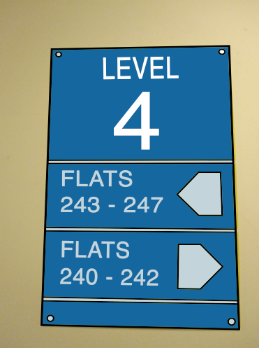
Here are some of images at the bottom which demonstrates my development and mock ups: 


Comments

Popular posts from this blog

OUGD603 | Extended Practice | Brief 03 | Development - Publication Layout design - Leah | BBC (Our Generation) - Life being British Born Chinese

Publication Layout - Leah For the inside of the 'Our Generation' publication, the collaborator Leah was in charge of this  brief's outcome segment. The publication's layout was constructed with 'Adobe Indesign' Leah made guide lines and measurements to help assist where the Photographs and the text should be placed. Illustrations of a paint brush stroke was experimented to give the pages more characteristics. We mutually agreed to make the size of the publication A5 format, and the number of pages are 16. Previously it was going to be 17, however one participant was unable to provided us with their childhood photo for us. Due to this situation Leah had to be more selective with the photos and information (Quotes) that we believe was significant for outlining our briefs context.  Below are some images of this layout format: Participant page order by names: Katie Sung  Leah Chen  Jackie Wan Tracey Lau Eliza Mo Kylie Lee Lewis Capper...

Studio Brief 01 - How Do You Read? - Second Development

In this blog, I have finish printing out the physical  small publication book of Design Principles. I believe this second  development work was successful as the colours of the type has  been nicely and evenly printed out.The information on the  pages are arranged properly in the right order as to the the one  on the Macbook. However, I need to chose a different type of paper  stock which is much sturdier, e.g - card stock. As when I put the rubber band around the spine of the book it curls. Even though the  visuals of the book is very minimalistic and simple I believe this is  appropriate to the audience who would read this kind of book context.  Especially, for young students who want to learn the right knowledge  and information of design principles, whilst becoming a Graphic Designer. For the colour scheme I went for a very neutral yet colourful scheme,  as these colours only outline the significant factors of Design...

OUGD603 | Extended Practice | Brief 04 | Final Design & Evaluation | Action against Animal Cruelty Campaign - Petection |

Final Design - Petection Adoption Gift Box Below are the finished photographs of the physical Petection adoption gift box.  Evaluation In conclusion the design process of our Action against Animal Cruelty brief also known as satisfactory. Initially at the beginning stages of the brief we were unsure to either do something minimalistic or extravagant  to produce for the final outcome of the brief. We wanted to make something which is able to make main consumers and new potential consumers the awareness of animals in cruelty (especially: cosmetic testing, medication/science, used for fur and adopt not buy.) One idea of final outcome was to create four seasons of animals magazine. The reason of this idea was that an editorial product such as a magazine will be able to convey the awareness of animals in cruelty. The second idea of the potential final outcome was to create an adoption gift box, with posters and a possible website mock-up design.  ...