The Brief
During the summer we had a task to collect and organise a photographic content that will be used in a publication named as "A-Z: Type in Context". In the publication it will explore the typography specific to a particular place. I must at least collected 26 photographs for at least one per letter. This can be a form of the following examples: road signs, shop windows, newspapers, placards, etc.
For each one that you collect you must write a short passage about the context in which it was taken:
- Where is it used and for what purpose?
- Is it effective?
- Is it easy to read?
- Does it communicate well?
When I find 26 photographs for at least one per letter of the alphabet, it will then be formatted into a 5-10 minute presentation.
To commence this brief, I went to a little town called Arosa in the country Switzerland for the summer holidays. There I made a theme of exploring nature in the summer season on the mountains of Switzerland. There was a lot of different signs either for directional, cafes, warning signs etc. Here are some images to show my collect photos:
 |
A – The letter ‘A’ of the word, Arosa can be seen. When tourists, skiers or hikers use the skiing cable cart to transport
themselves up the many mountains of Switzerland. The typeface on this certain
poster is used inside a skilling cable cart station, it is for tourist to
visually recognise that the place Arosa offers an adventurous
experience of skiing down the mountains of Switzerland. This is effective due
to the use of colours, illustration style of typeface giving it a very retro
image. It is quite clear handwriting font that any tourist can read and
understand. The communication of the letter/word is conveyed very well, this is
due to the boldness of the kind if typeface.
 |
B – The letter ‘B’ of
the German word, BUDEMI can be seen. When hikers walk on the mountains of
Switzerland to follow the directional signs. The typeface on this specific way
finding signage is used effectively to attract the hikers due to the material
of the signage and the modern sans serif font. The Sans serif typeface is clear
to read, due to the contrast in colours. The communication of the word/letter
is depicted well, as it is clear for the hikers to go in the right direction of
their destination.
|
 |
D – Local/tourist hikers on the mountain can see the
letter ‘D’ in the German word, Danke Auf Wiedersehen which translates to Thank you Goodbye. This can be seen when
local/tourist hikers find a café on the mountains whilst walking. The typeface
of this chalkboard is hand written but in sans serif font. This sort of style
of hand written lettering is effective due to the colour choice and the
boldness of the letters. It is quite clear to understand as the letters and
well spaced out and easy to read. The communication of the word is
understandable for locals to read, however some tourist may struggle due to the
lack of German and how close the letters are together.
 |
K – The letter ‘K’
of the German name of the hotel called, Kulm. This hotel informs customers
that this is a hotel that they have booked at. The effectiveness of this typeface
highlights customers of the hotel, that this particular residence is high
classed. This is conveyed by the use of serif curly writing and the colour of
the gold. Giving the hotel a rich and luxury feel, this specific typeface may
have some difficulties to read as the letters are quite close to together. Thus
making it look like a completely different word. It communicates well for what
kind of style the hotel want to present their visual image.
 |
R – The letter ‘R’
of the name of the hotel called, Ratschli informs visitors/tourist
that this building is a place to stay and rest. The effectiveness of the font
is a unique type of sans serif font, giving the place a very retro image. This
is strengthened by the colour scheme, the contrast of the orange and white. The
size of the font is quite noticeable as it is big. The communication of the
word is good, as the size and colour the font stands out well compared to its
surroundings.
 |
U – The letter ‘U’ of the German word Unserer,
translates to our in English. The whole German sentence Willkommen Auf Unserer Terrasse translates
Welcome
on our terrace. This sign invites tourist/hotel guest to the hotels
terrace to see the view of the mountains. The effectiveness of the lettering is
good as the handwriting of the sans serif font makes it look friendly,
approachable and inviting. The writing of the words is not difficult for anyone
to read as it is evenly spaced out, and the words are in white chalk. This sign
communicates well as illustrations of colours make the hotel a welcoming
environment.
 |
F – The letter ‘F’ in the German word, Fussganger which translates to Pedestrian can be captured when hikers come off the cable cart and signage shows
the direction for specific paths for hikers, cyclist etc. It is effective as
the typeface is clear to read, as well as the colours that indicted the various
directional paths for people to take. It is easy to read when coming close to
the sign but from a distance is difficult. The communication of the way finding
signage is average, its not too big or small. It quite thin than bold, the
coloured arrows help to catch people’s eyes.
|
 |
G – The letter ‘G’ in the word, Gourmino can be seen when
tourist/locals travel on a train carriage to various places in Switzerland. The
carriage of the train is to specify which carriage is a dining/restaurant for
travellers to have a meal during their journey. The effectiveness of the typeface
on this carriage highlights the type of food is serviced during the specific
service. The serif font indicated the classy, fine dining and elegant the food
that the train serves. The colours of the carriage give a regal image the royal
blue and the golden. The type of font used in this concept is understandable,
clear to read. The communication of the word is effective to deliver the
richness and expensiveness to the public.
|
 |
H – Skiers/hikers and the public
travelling up the cable cart can see the letter ‘H’ of the German name, Hornli.
The purpose of the name Hornli is to inform the public that
this is the name of the cable cart station. It is effective due to the simple,
yet clean choice of sans serif typeface, which is easy to read. The colour
choices also help bring out the lettering, as there is a big contrast between
the white background and the blue lettering. The communication of this word is
good as it does its purpose of informing the public where they are in that
certain area.
|
 |
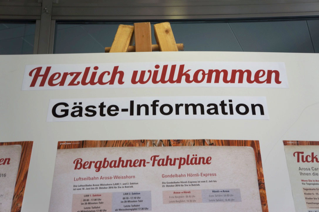
I – The letter ‘I’
in the German word Gaste-Information which translate to Guest Information, indicates where locals, hikers, and the
publics can obtain important detail in how to travel up a mountain with safety
precautions. The effectiveness of this typeface is that it is clear for
tourists to see that it is vital information. The typeface is simple, clear and
easy to read for any tourist wanting to knowledge. It communicates it purpose
well, indicating what kind of information, which the tourist/public would like
to obtain.
|
 |
J – The letter ‘J’
in the German word, Phanoemen Jagd this translate to Phanoemen hunting, tells the public or tourist the
name/information of the animal in German. This is effective as the typeface is
simple sans serif typeface; this is strengthened by the image of the animal
next to the text. The colours of the poster make the text distinctive from the
background. As black is more of a bolder yet richer colour, compared to the
pale light blue background. The poster communicates well to locals, due to the
sans serif typeface and the German words. However, may be difficult for those
tourists, which have no knowledge of the German language.
|
 |
L – The letter ‘L’
of the German name of another hotel and bar called Locanda is to attract
tourist for staying yet dining at the hotel. It is effective as it has a
mixture of both serif/ sans serif typefaces making not hard for locals or
tourist to read. It is quite easy to read by the curls of some of the letters
may look like a different letter. The communication of the word conveys well as
it gives the hotel/bar and very vintage yet modern look.
|
 |
M – The letter ‘M’
of the German name of café called, Muggaloch is to attract attention of
hikers/tourist as a place to rest during walking through the mountains of
Switzerland. The type of hand written sans serif font, gives the café a
welcoming yet friendly setting. This is due to the colour and shape of the
place, the naming of the place is clear to see when hiker/tourist walk closer
to the café. However, hikers/tourist may struggle to see and read it from a
certain distance.
|
 |
N – The letter ‘N’
of the brand name of a shop called, de nicola is to draw attention to
shopper and tourist to buy the shops clothes. The effectiveness of the type of
font is good as every letter is in a lowercase form. Because of this lowercase
use it can make the shop look more approachable for the customers that which
they want to aim at. The font is clear, simple and smooth to read which is
ideal for any internationality. The communication of the word conveys well as
the style of the brand is unique.
|
 |
|
O – The
letter ‘O’ on the sign of the arrow, Pratschalp Often which translate to Pratschalp Open informs hikers in
which direction the place is if they continue following the route. It is quite
effective as the person who written this did it by there own DIY work. This is
due to the colour pen that they used to write the place down. Also the capital
letter stand out more compared to lowercase font. It is easy to read when
hikers get closer to the sign, but they may struggle from a distance. The
communication of the sign does it function of telling the hikers which direction
the hikers want to go to. |
 |
P – The letter ‘P’
of the office called, Post, informs locals where they can
send or collect their mail. It is effective as it is in a sans serif front and
capitalised letters. It is very easy to read due to the scale it is on and how
big the font is on the building. The communication of the name of the building
conveys well as it is a very international word.
|
 |
Q – The letter ‘Q’
of the water station called, Apparategebaude Genderquellen translates to Apparategebaude Gender sources and Quelleinlauf that means source inlet informs workers to regular checks on the water supply pressure levels and
conditions. This is effective due to the boldness of the lettering of the word
striking a significant. The font maybe too small to read when seeing from a
distance, especially from the size of the font.
The communication of the word does its function by informing German
workers about the water supply pressure levels.
|
 |
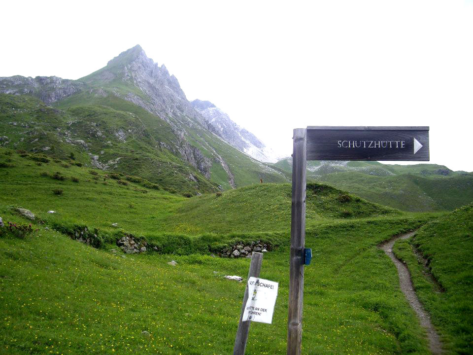
S – The letter ‘S’
of the walking sign directs hikers/tourist to a place called, Schutzhutte.
The effectiveness of the sign of the word is decent as it does its function of
telling hikers/tourists on where they are walking. Thus the uppercase letters
help emphasise the importance of the place. From a distance, hikers/tourists
may find it difficult to read due to the thin typeface. Once they get closer it
becomes easier to read. The communication of the sign does its function of
directing hikers where the place is, but it would be more helpful if the sign
also had how many miles to the location is.
|
 |
T – The letter ‘T’ advertises the most famous
chocolate, Toblerone in Switzerland in a sculpture form called attracts
hikers; cyclists and tourists to purchase the chocolate whilst travelling up
the cable cart. The effectiveness of this big advertisement is very well
displayed as it is up in the mountains and is big enough for anyone to see it
during the slow journey up the cable cart. The type of typeface is quite
powerful due to the colour and the boldness of text. Also it is more dynamic to
the eyes of the hikers, cyclist and tourist as the shape of the chocolate is
the same shape but ten times bigger. The big advertisement does its function as
it lures potential customers to by the product; especially it is from the place
it was made.
|
 |
V – The letter ‘V’
for the signs indicating where the planet Venus, informs hikers/tourists where
the planets will be place on the mountains of Switzerland. Its quite effective
as many hikers use the path to get down to the town of Arosa, and it is
interesting to know that the planet Venus is located in that certain area. The
typeface is very average as it is in the serif font. But it is bold enough to
see it. It communicates well for local hikers as everything is in German, some
tourists may struggle with the language barrier.
|
 |
W – The letter ‘W’ for the place, Waldbuhne,
directs locals, hikers and tourists to the destination in which they
would like to go. The effectiveness of the sign is works well for its function;
this is due to what material that the sign is made of, the colour and the
environment surrounding it. As Arosa is very countryside area, the signs make
it very authentic to what it would originally look like in the past. The choice
of typeface is easy to understand and read, as it is not too big or small to see.
The communication of the sign does it purpose as it informs hiker, locals and
tourists in the right direction.
|
 |
X – The letter ‘X’ in the name of the Swiss army
knife shop called, Xictorinox informs visitors and the public what products they
sell. This is effective as the name is an unusual and different, the black font
against the white background makes the name stand out. This is also help by the
products in the stand, which shows what the customers are purchasing. It is
easy to read as the kerning of the word is evenly spaced out and how it is in uppercase
letters. The communication of the word does its function, by showcasing the
products with the brand.
|
 |
|
Y –
The letter ‘Y’ in the two words Simply and Deeply is a quote inside
one of the café of Switzerland. The purpose of this particular quote, informs
customers to live happy in your life and explore new things. This quote is
quite effective as it is emphasise in capital letters and inside the boldness
of each individual letter has small words inside it. From a distance it is easy
to read, however the smaller words will have some difficulties. The
communication of the words does its function of making the quite eye catching
enough to see it. |
 |
Z – The letter ‘Z’
of the sign for parking, Zentrale Parkuhr translates in
English to Central parking meter. Here the sign directs drivers to a
parking space to walk up the mountains of Switzerland. The effectiveness of the
sign is powerful with the giant P and the icon of a parking meter.
However the letter Z is too small to see from a distance. The communication of the
sign does it function of leading drivers to a space to park for their car.
|
 |
C – The letter ‘C’ of the German word, Coiffure
can be recognising by locals if they want a haircut. The typeface of
this hairdresser’s signage is serif; giving the hairdressers a very traditional
yet has a classical image. It attracts the locals by the use of curly
handwriting font and the brightness of the colour, yellow. The kind of serif it
is written in can be quite difficult for tourists that do not understand
German. The communication of the word/letter can be misunderstood as the curly F/R can
be seen in either the letter P/N.
|
|
|
E – The letter ‘E’ in
the German word, Einkaufs this is translated to Shopping can be seen in a small town called Chur. The typeface
of this word is in Helvetica, which is a popular typeface that is worldly used
internationally. The word is to inform the shoppers that the building is a
centre district to shop at. It is effective due to how clean and cut the typeface
is, the colours also help stand it out. It communicates very well as the
typeface is used internationally for all tourists to understand.
Here are some other images from another location I went to in the summer. This was the Lake District in England:
|


Comments
Post a Comment