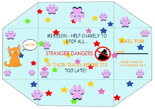
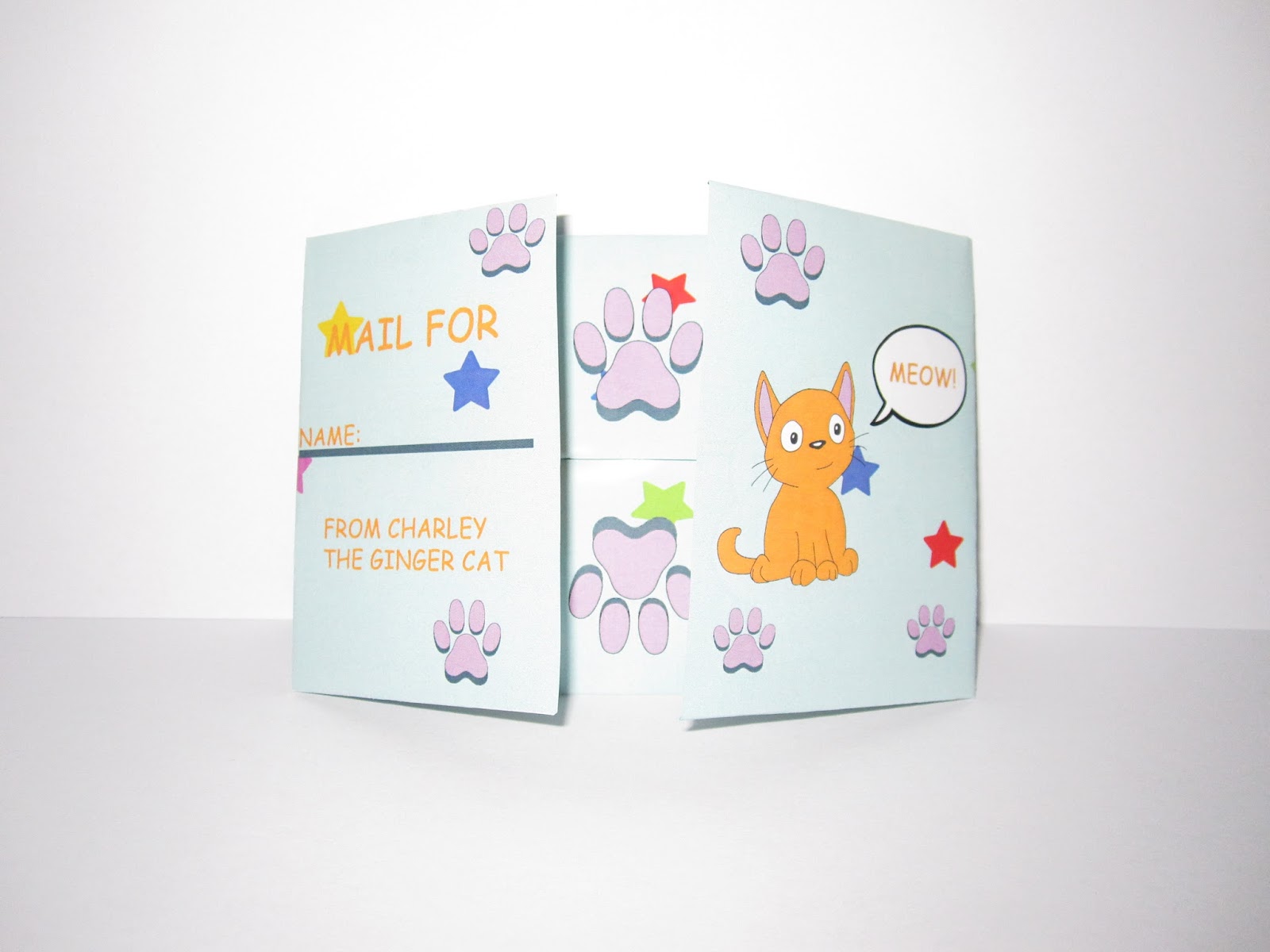
After my critique lesson I started to develop more on my public information leaflet. Here I followed my peers advice on my previous leaflets and finally design my final leaflet which are the images on this design bore. I tried to be more experimental with my colour palette and use more pastel colours to make it more friendlier for my target audience. I wanted the leaflet to unfold into a poster as well so children could place it on the wall.
Evaluation
In conclusion, this is my final piece printed in a thin glossy paper and a solid glossy paper to see which material is more durable when it comes to mailing it or giving it to
children at their schools when being taught the safety of Stranger Danger within lesson. From the experiment the thin glossy paper is much better compared to the solid one
as the thin material is easier to fold, plus the information on the leaflet was not damaged as much compared to the solid one. In addition, I am pleased with my final design,
the colour scheme is appropriate for my target audience as its not to girly, so its suitable for both young boys and girls in primary school. However, in the leaflet there is no
facts or statistics as my reason was that this leaflet is aimed at children and they will most likely not understand the meaning of that. Compared to specific instructions that a
child would listen to especially with the redesign of Charley the Ginger Cat. But I am quite disappointed with the size of the leaflet as I wanted it to open into a poster for
children to stick on their bedroom walls and remember the important information. The typefaces are simple, clear to read as I have used comic stands and century gothic.


Presentation
Comments
Post a Comment