OUGD603 | Extended Practice | Brief 03 | Development - Publication Layout design further development | BBC (Our Generation) - Life being British Born Chinese
Secondary Publication Layout Development
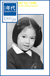
Due to my collaborator's timescale and work circumstances - I further developed the publications layout and contents. Within this development stages I tried to keep with the guidelines within the publications layout and added more Graphics or designs to the publication as the previous layout was empty and too plain. To make the publication more appealing I reused the polaroid vector and at the bottom of it, placed my collaborators written names illustrations. This will give an idea that it is the participants that has written their name on their page.
To reiterate keeping to the colour scheme (red, blue and yellow) each participant's pages are colour coordinated but has the other colours either in text or a paint brush stroke to keep the colour scheme consistent. The photographs were converted into a black and white (monochrome) tint as if we kept the original colours it will look like a children's book than a British Born Chinese documentary publication. In addition Birthday dates and 'Generation' eras (first, second and third) were also placed in the publication this allows the reader to understand which British Born Chinese participant relates to another and how they grew up differently. The idea of this page layout is inspired by giving each participant a profile page.
Below are some examples:


Leah Chen's Publication Pages Development - further information Leah's Blog
One example of the new publication pages that my collaborator Leah has redesigned:

She tried to use the same design elements that were to make up the page of the individual and publication. After a small briefing with my collaborator, we mutually agreed to produce more design changes from the previous developments. My collaborator replaced the digitalised hand writing illustrations with using the typeface 'Helvetica'. This allows the whole publication to have a consistent theme.
Due to my collaborator's timescale and work circumstances - I further developed the publications layout and contents. Within this development stages I tried to keep with the guidelines within the publications layout and added more Graphics or designs to the publication as the previous layout was empty and too plain. To make the publication more appealing I reused the polaroid vector and at the bottom of it, placed my collaborators written names illustrations. This will give an idea that it is the participants that has written their name on their page.
To reiterate keeping to the colour scheme (red, blue and yellow) each participant's pages are colour coordinated but has the other colours either in text or a paint brush stroke to keep the colour scheme consistent. The photographs were converted into a black and white (monochrome) tint as if we kept the original colours it will look like a children's book than a British Born Chinese documentary publication. In addition Birthday dates and 'Generation' eras (first, second and third) were also placed in the publication this allows the reader to understand which British Born Chinese participant relates to another and how they grew up differently. The idea of this page layout is inspired by giving each participant a profile page.
Below are some examples:


Initial New Page Layout Design


Leah Chen's Publication Pages Development - further information Leah's Blog
One example of the new publication pages that my collaborator Leah has redesigned:
She tried to use the same design elements that were to make up the page of the individual and publication. After a small briefing with my collaborator, we mutually agreed to produce more design changes from the previous developments. My collaborator replaced the digitalised hand writing illustrations with using the typeface 'Helvetica'. This allows the whole publication to have a consistent theme.
Comments
Post a Comment