OUGD603 | Extended Practice | Brief 04 | Final Design & Evaluation | Action against Animal Cruelty Campaign - Petection |
Final Design - Petection Adoption Gift Box
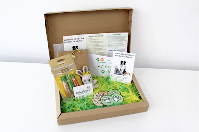
Below are the finished photographs of the physical Petection adoption gift box.


By using the google drive as a media sharing platform that my collaborator, Aneta sidorko we both could access. This platform was beneficial for the both of us as we were able to edit, critique, share informations and work on each others designs. The google drive made everything organisable as we put them in folders: colours, development, typefaces, sketches, vectors, Photoshop, Photographs of animals and so on. This sharing media platform was appealing as we were able to given each other constant feedback.
Due to timescale we were unable to deliver a four different editorial pieces for cruelty of cosmetic testing, used for fur, medication/science, and adopt do not buy. One reason of our drawback on this idea was due to as our own individual spearate projects, lack of editorial skills and techniques (Bleed, pages and layout), and deciding which research information is more significant for the magazine. Therefore an adoption box was also considered as a secondary idea to persuade and make aware animal cruelty is still continuing.
However, since we planned to produce a few physical products for the inside of the adoption gift box. Due to our own separate work and time scale we were unable to develop and elaborate on this especially a physical t-shirt design of the campaign and being able to photograph it in the studio worn by models.
Overall, the brief challenging yet adequate. The main challenges of this brief was decide what we wanted to put in the adoption box. We collected a lot of research and information of existing adoption gift boxes and majority of them included a few practical pet/animal produces. But for our approach we wanted to gift a present to the consumer for donating for the campaign and saving potential animals still in cruelty. We were able to exacute posters and website mock-up designs which the consumer can look more into the adopting scheme and what the campaign does to help animals in cruelty. Nevertheless the collaboration and communication between Aneta was sufficient as we worked very well together helped each other in designs aspects, we considered each others personal projects and tried to communicate and respond if needed.To conclude I would collaboration with Aneta again as we did communicate well (especially when using the google drive platform to share designs.)
Below are the finished photographs of the physical Petection adoption gift box.


Evaluation
In conclusion the design process of our Action against Animal Cruelty brief also known as satisfactory. Initially at the beginning stages of the brief we were unsure to either do something minimalistic or extravagant to produce for the final outcome of the brief. We wanted to make something which is able to make main consumers and new potential consumers the awareness of animals in cruelty (especially: cosmetic testing, medication/science, used for fur and adopt not buy.) One idea of final outcome was to create four seasons of animals magazine. The reason of this idea was that an editorial product such as a magazine will be able to convey the awareness of animals in cruelty. The second idea of the potential final outcome was to create an adoption gift box, with posters and a possible website mock-up design. By using the google drive as a media sharing platform that my collaborator, Aneta sidorko we both could access. This platform was beneficial for the both of us as we were able to edit, critique, share informations and work on each others designs. The google drive made everything organisable as we put them in folders: colours, development, typefaces, sketches, vectors, Photoshop, Photographs of animals and so on. This sharing media platform was appealing as we were able to given each other constant feedback.
Due to timescale we were unable to deliver a four different editorial pieces for cruelty of cosmetic testing, used for fur, medication/science, and adopt do not buy. One reason of our drawback on this idea was due to as our own individual spearate projects, lack of editorial skills and techniques (Bleed, pages and layout), and deciding which research information is more significant for the magazine. Therefore an adoption box was also considered as a secondary idea to persuade and make aware animal cruelty is still continuing.
However, since we planned to produce a few physical products for the inside of the adoption gift box. Due to our own separate work and time scale we were unable to develop and elaborate on this especially a physical t-shirt design of the campaign and being able to photograph it in the studio worn by models.
Overall, the brief challenging yet adequate. The main challenges of this brief was decide what we wanted to put in the adoption box. We collected a lot of research and information of existing adoption gift boxes and majority of them included a few practical pet/animal produces. But for our approach we wanted to gift a present to the consumer for donating for the campaign and saving potential animals still in cruelty. We were able to exacute posters and website mock-up designs which the consumer can look more into the adopting scheme and what the campaign does to help animals in cruelty. Nevertheless the collaboration and communication between Aneta was sufficient as we worked very well together helped each other in designs aspects, we considered each others personal projects and tried to communicate and respond if needed.To conclude I would collaboration with Aneta again as we did communicate well (especially when using the google drive platform to share designs.)
Comments
Post a Comment