
Studio Brief 02 | Product, Range and Distribution Brief | Disabilities or Breastfeeding in Public Campaign Sketches & Ideas

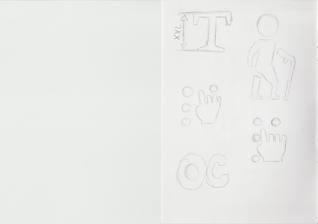
To commence this brief, I did some sketches on both issues 'Disabilities & Breastfeeding' this will allow me to get a better guide line on how I would like to present the issue to the public eye. 

These sketches were very quick and rough of either semiotics/symbols of both issues. For example the disability campaign informs the audience not to damage or misuse of universal designs and the breastfeeding campaign is to inform the audience that it is not against the law to breastfeed in public places. 

Below are the sketches of both campaigns. I am unsure which issue I would like to create for this brief, so I will receive feedback from the sketches. This maybe come with other ideas that my peers and tutors could advise me to do for my final product. 

Powerpoint screenshot of both issues


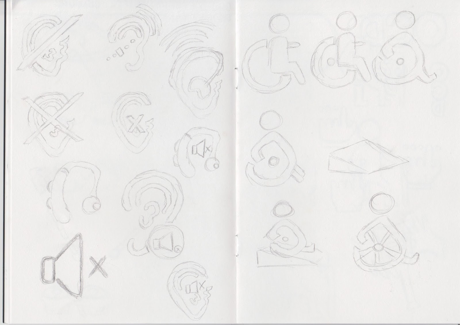
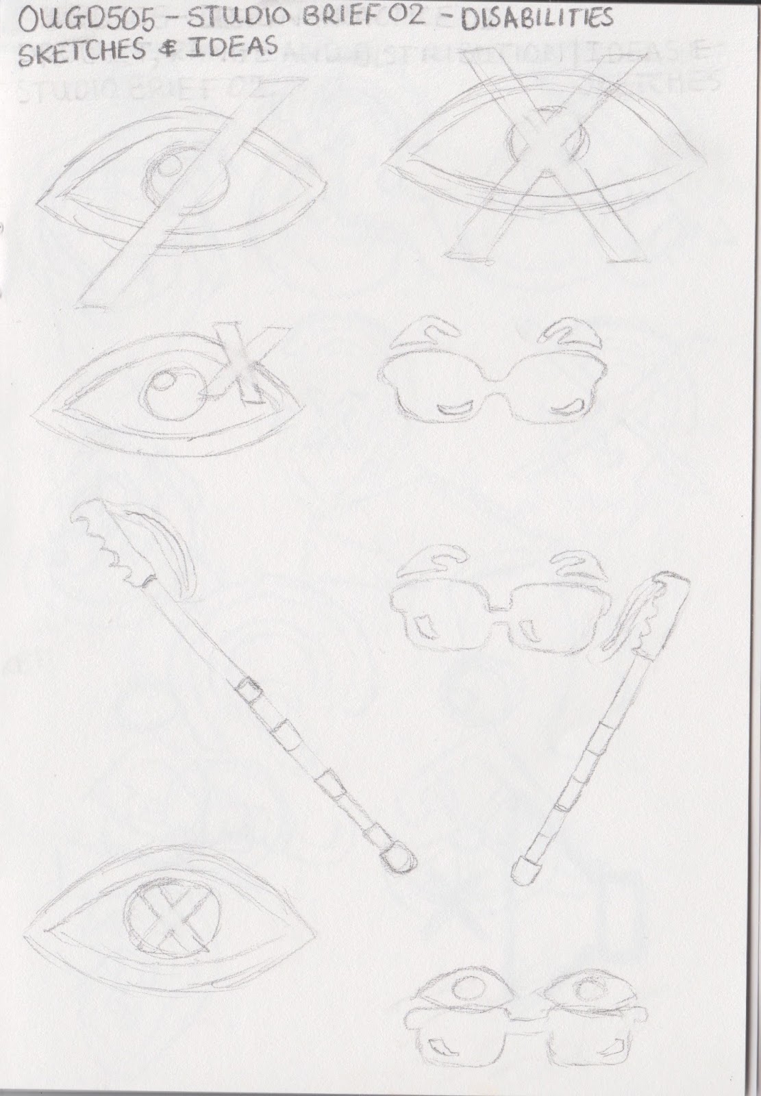
Disabilities & Breastfeeding in Public Campaign Ideas & Sketches


Comments

Popular posts from this blog

Type in Context - Final Indesign Layout

After the trial and error of printing the pages with my first intial scrapbook concept. I decide to change the layout of my  pages as the first layout was difficult to work with when adding text.   Instead I did a layout like this (images are below) the text and photographs are in more of a consistent and organised scale. My peers gave me advice on what text to put within my publication pages, they said facts and figures will be interesting as it will relate to the photographs. Because of adding more photographs/text to the pages of the publication, I therefore had to add more pages. So in the end, there was about 30 pages in my publication. Overall, the images on the Indesign preview look decent and I will print this out within the Digital Print room’s paper stock. 

Studio Brief 01 - Secret 7: Final Design

In this design board, I have chosen this Record Sleeve design cover to be my final  submission for the live brief - Secret 7. I particular favoured this design as it really  portrayed the artists song and style well as the variety of the different shades of blue tones gave a good theme for the overall concept of the chosen lyric that I selected. “You were the perfect star. Again describing the meaning of the design will be yet again explained here. The symbolism  of the star is similar to a heart of the person who is going through a heart break thus this  is similar feeling when the break bit is being cracked like glass. The glass look makes it  highlight that the person’s heart is very sensitive and weak and the colours of the different  shades/tones of blue express their unhappiness and also how innocent and pure they are. The way the star outline repeats depicts how the person is slowing forgetting the perfect star  which has broken the heart...

Studio Brief 01 - How Do You Read? - Second Development

In this blog, I have finish printing out the physical  small publication book of Design Principles. I believe this second  development work was successful as the colours of the type has  been nicely and evenly printed out.The information on the  pages are arranged properly in the right order as to the the one  on the Macbook. However, I need to chose a different type of paper  stock which is much sturdier, e.g - card stock. As when I put the rubber band around the spine of the book it curls. Even though the  visuals of the book is very minimalistic and simple I believe this is  appropriate to the audience who would read this kind of book context.  Especially, for young students who want to learn the right knowledge  and information of design principles, whilst becoming a Graphic Designer. For the colour scheme I went for a very neutral yet colourful scheme,  as these colours only outline the significant factors of Design...