What is being demonstrated here, is practicing how to coptic bind on a wooden cover.


Firstly, I got my two covers and drilled in some holes for the thread and needle to go in when binding. The width from the edge of the cover was 0.5cm and going from the top to the bottom of the cover was 2cm.


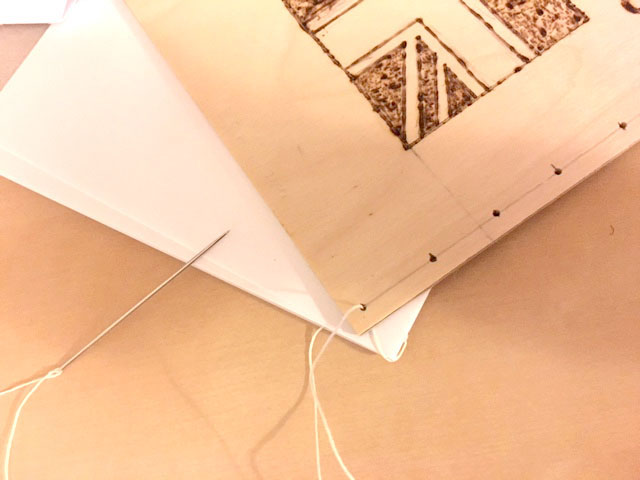
Now thread the needle up through your cover making sure to come up on the right hand side of your first stitch. Slide the signature to the edge of the cover and pull tight, then loop around from left to right (as shown) and go back into the first hole. Move across to the next hole and do the same – thread your needle up through the cover and then loop around and pull tight, go back into the same hole you just came through (this time you do not need to tie a knot). Repeat until you have reached the last hole on your cover.

Take the second signature and place it on top making sure the holes line up. Thread your needle into the hole and then move across to the next hole. Now to secure the two sections together, take the needle around the back of the stitch below always making sure to go in the direction of travel. When you are ready, take the third signature and place it on top. Thread your needle into the first hole.
On your second stitch remember we are travelling from left to right, so now you will loop the needle behind the stitch beneath, moving from left to right. Thread your needle back into the hole you came from and then move along to the next hole. Repeat until you have just one signature left, then take the front cover as you are going to sew both of these at the same time. Thread your needle down through the cover first and then loop around the stitch underneath. Now thread your needle into the final signature and across to the next hole. For the remaining stitches, loop around the stitch beneath first, then thread your needle through the cover and around the back as shown. Continue as before by going back into the same hole and across to the next one. After you have completed the last stitch, thread your needle inside the book and tie a double knot to secure. Use a craft knife or scissors to neaten any lose ends.

Once the holes where in placed. I started putting holes in for the pages (I used cartridge paper first as a tester), instead of sewing each individual pages. I decide it would be easier to do it in three piles of pages. After that, I got a scrap piece if A4 paper for the guide lines for the holes to go in. To match the holes of the pages to the cover, I simply used the covers and made a pencil mark of where the holes should be placed. This will then be my template for the piles of pages for the binding process. Once that was done, I put the remaining pile of pages behind the template, then use the awl to pierce the holes. Then continued this for the other remaining piles of pages.


Above is what the covers and pages should be in this order when binding them together.

For the binding process, I decided to do a single coptic bind. To start, take your first signature with the cover underneath and start on the inside of the signature leaving a small amount of thread to tie off (hold this with your finger so it doesn’t slip through.)

Take the second signature and place it on top making sure the holes line up. Thread your needle into the hole and then move across to the next hole. Now to secure the two sections together, take the needle around the back of the stitch below always making sure to go in the direction of travel. When you are ready, take the third signature and place it on top. Thread your needle into the first hole.
On your second stitch remember we are travelling from left to right, so now you will loop the needle behind the stitch beneath, moving from left to right. Thread your needle back into the hole you came from and then move along to the next hole. Repeat until you have just one signature left, then take the front cover as you are going to sew both of these at the same time. Thread your needle down through the cover first and then loop around the stitch underneath. Now thread your needle into the final signature and across to the next hole. For the remaining stitches, loop around the stitch beneath first, then thread your needle through the cover and around the back as shown. Continue as before by going back into the same hole and across to the next one. After you have completed the last stitch, thread your needle inside the book and tie a double knot to secure. Use a craft knife or scissors to neaten any lose ends.


Above is the finished results. I believe, for the first try of this it went very well. Some parts of the instructions were complicated, however I manage to fix it.
Comments
Post a Comment