Irma Boom - Publication Designer & Study Task 02

Irma Boom


Irma Boom, is a Dutch graphic designer (born 15 December 1960 in Lochem, Gelderland, Netherlands) who specialises in book making. Boom has been described as the ‘The Queen of Books', having creating over 300 books and is well reputed for her artistic autonomy within her field. Her bold experimental approach to her projects often challenges the convention of traditional books in both physical design and printed content.

When building book, Boom’s books take on an object-like architectural form. They are to her a unique medium for delivery of information. A thorough reflection of the information contained leads Boom to her design decisions. It is her aim to enhance the readers understanding of content while at the same time creating an object of beauty, with quality and permanence. Just like a building, Boom considers the entire landscape of the book including the edges. She builds three-dimensional models in miniature scale to aid in the development of her books. From typography to material, every detail Boom applies to her projects possesses an underlying logic.
Unconventional typographic trademarks of Boom may include the use of oversized type which successively shrinks from the opening to end of her book. This claims is a way to lure people into reading the introductory pages.

Best Known Book Creations
SHV Think Book 1996-1896
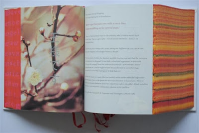
This book was ‘the landmark book’ in Boom’s career. The 2,136 page book was worked on for a span of five years before being published in 1996. Three and a half years were dedicated to intense research in Amsterdam, Paris, London and Vienna. It contains no index or page numbers and is anti-chronological. This was to encourage readers to approach the book without constraints, but rather surprise and discovery. Tulip fields and a Dutch poem were incorporated into the edges of the book, viewable depending on the direction in which each page is flipped. It is an unusually thick book measuring 22.5 x 17 x 11 cm. It started with Boom being asked to ‘look for the unusual’.[1] It was created with the editorial of art historian Johan Pijnappel. Initially there had been consideration in publishing the content as a CD-ROM, but a book proved to be a more timeless and opportunistic option. The book’s cover is in entirely white linnen but reveals a title after frequent use. An alternate version comes in black. Transparent adhesive had been typographically applied to collect dust and finger prints. Creating a blank covered book had alarmed publishers who feared it would not sell. Its production proved to the contrary. It was the book which elevated her to international design stardom. The anniversary book was one of her biggest and communicated a narrative on the history of that company. It was designed to be distributed worldwide, yet Boom has calculated that it will take five hundred years for the book to spread to all the corners of the globe. Four thousand copies were printed in English and five hundred in Chinese. It has been described as an international icon of Dutch design. It is part of the permanent collection of MoMA.
This is a publication that commemorates the centenary of one of the Netherlands’ largest multinationals, SHV. The Dutch public knows very little about SHV or its activities and this object is similarly mysterious. Its pages form a daunting stack of almost ten centimetres. It has no obvious title, no page numbers, no table of contents, no chapters, no index, no colophon. Its chronological structure runs in reverse.

The book’s hidden title is thinkbook, but the thought that explains this past verges on the imponderable. The think book contains three kinds of information: pictures, original documents, internal memos, minutes of meetings, price lists and press releases and newly typeset texts in English. Text and pictures each take up roughly half of its 2,136 pages. Scattered throughout are questions set in larger type: “Is this a question for you?”… “Where do our emotions separate from our thinking?”… “Has change produced progress?” The typographic presentation is elegant and reserved but there is no indulgence in typographic play. The layout is conservative, with one exception: the margins are extremely small.

The illustrations also taken from SHV’s archives and rarely have any captions. All are covered with a fine horizontal screen rendering them slightly out of focus, as if viewed on a television screen. The colours are often unnatural. There is an impressive series of photographs of company workers taken in a coal mine around the turn of the century. But these people have no names. The people with names are the shareholders and their families, transfigured in pale, heavenly blue.

The thinkbook is a monument built to withstand time, but in some ways it is like a newspaper. It records the economic history of trade and commerce and, like a newspaper, shows social actions and offers public information about daily life.


Study Task 02 - Stefan Sagmeister

Stefan Sagmeister is an Austrian and a New York-based graphic designer and typographer (born August 6, 1962). Sagmeister co-founded a design firm called Sagmeister & Walsh Inc. with Jessica Walsh in New York City. He has designed album covers for Lou Reed, OK Go, The Rolling Stones, David Byrne, Jay Z, Aerosmith and Pat Metheny.


Publication Creations

Sagmeister: Made You Look 


Within this publication Sagmeister has created the book known as, 'Made you look' display innovative work that shows graphic design can also be cut to the emotional core. Fully illustrated, with a red PVC slipcase, this monograph covers twenty years of his graphic design and features images from the studio archive as well as specific influences and reference points for his projects and ideas.

When analysing the publication. I believe that this is an excellent book and his range of ideas is fascinating when being displayed on the pages.

The publication of his work really inspires me, to do my publication as it contains his thought process and the amount of effort he puts into every design. The book itself is wonderfully produced, the paper is of good stock and the book is certainly unique.



Comments

Popular posts from this blog

Type in Context - Final Indesign Layout

After the trial and error of printing the pages with my first intial scrapbook concept. I decide to change the layout of my  pages as the first layout was difficult to work with when adding text.   Instead I did a layout like this (images are below) the text and photographs are in more of a consistent and organised scale. My peers gave me advice on what text to put within my publication pages, they said facts and figures will be interesting as it will relate to the photographs. Because of adding more photographs/text to the pages of the publication, I therefore had to add more pages. So in the end, there was about 30 pages in my publication. Overall, the images on the Indesign preview look decent and I will print this out within the Digital Print room’s paper stock. 

Studio Brief 01 - Secret 7: Final Design

In this design board, I have chosen this Record Sleeve design cover to be my final  submission for the live brief - Secret 7. I particular favoured this design as it really  portrayed the artists song and style well as the variety of the different shades of blue tones gave a good theme for the overall concept of the chosen lyric that I selected. “You were the perfect star. Again describing the meaning of the design will be yet again explained here. The symbolism  of the star is similar to a heart of the person who is going through a heart break thus this  is similar feeling when the break bit is being cracked like glass. The glass look makes it  highlight that the person’s heart is very sensitive and weak and the colours of the different  shades/tones of blue express their unhappiness and also how innocent and pure they are. The way the star outline repeats depicts how the person is slowing forgetting the perfect star  which has broken the heart...

Ideas for Type in Context Publication

IDEAS In this blog post, I have found some examples on how I would like to layout my Type in Context Publication. As my target audience is aimed at people who like hikers and historians. This type of publication will inform the readers how our way finding signages have stayed the same rural design. For the amount of text I want within my publication, the direction of where this publication is going will only be a minimum amount of text. This maybe only just an introduction page and possibly a content page.  The publication will either be a rural guide book or a coffee book for cafe where tourist/hikers/cyclist and so on, stop to have a break for some refreshments. The target audience of this specific type of publication will be at a demographic (geographical).  To create this type of publication, I will use Indesign to help me arrange and layout my pictures. This will then be easier for me to print it out professionally.  The siz...