Throughout the research process I explored many type of exsiting art & photography publications from a professional standard (e.g - WALL AND PIECE, Banksy, 20 Iconic Film Posters, Saul Boss, previous student standards (Leeds College of Art students) and online images of publications (Pinterest).
Here I can examine how they are presented and the arrangement of the images and text of design layout.
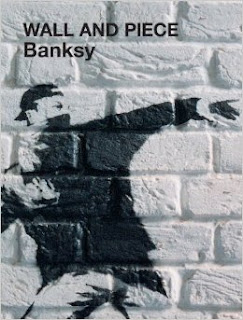
WALL AND PIECE, Banksy
In this Art & Photography book it displays the places within the London, where tourist or art fans can find Banksy Graffiti art. This book is full of great pictures. It makes a great 'coffee table' book and ideal present. Even though its graffiti, its quite inspiring. Especially how it is displayed and the layout of Banksy's Art on the pages is concise, iconic and ephemeral. The book keeps to its context of highlighting the what the underbelly of society thinks about politcal and social issues.


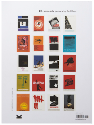


20 Iconic Film Posters, Saul Boss
Within this Art & Photography publication which presents the collection of 20 iconic film posters by Saul Bass, one of the greatest American designers of the 20th century, which is a must for graphic designers and film fans. The publication is filled with great images of Bass' poster designs. The layout and display of the poster design on the pages are evenly spaced out, concise and organised well. The use of the white space is utilised correctly, especially on how the text is in line on the pages.


LCA Previous Students Publication Designs
In University, the tutors offered us some past students publication designs that they did for a similar brief that we are executing. Whilst looking into these publication, most of the books contained a lot of Art & Photography concept. Either it was typography in a graffiti in a certain city, typography in a different country, neon typography and so on.
The repetition of the students who designed these publication, made a benefit out of the white space that they had given themselves. Some publication had more pages than others, some had more text / information. But it all comes down to what concept they had in mind and the way they wanted to convey it through the publication they made. There are some images below of the previous students publication. I will use their layout and publication designs as a guide line to how to arrange and construct my publication.
Pinterest Publication Designs
On Pinterest, I was seeking for more innovation on my publication specifically on layout, cover, text and images. In the end, I found three types publications of which had distinctive layout on the pages. Some pages were a lot smaller than the others, some had more text. But there was a key difference between them, for example: One of the publication had a circle concept for laying out the images and text, the others two were either squares or rectangles layout. The circle concept layout had a specific colour theme e.g. Orange and black & white images, the other two were just black and white or just more colourful images.
The size of the three publication appeared to be in a A4 size, thus this is how more images where able to fit on a page. To alliterate, I will be employing this type of layout designs as an experimentation for my publication.


Comments
Post a Comment