In this blog I am researching which typography/typeface would be the most acceptable for the Type in Context publication that is being initially constructed. During my feedback session from the previous critiques, many of my peers and tutors said the Sans Serif typefaces will be the most applicable for this type of prototype.
This is also strengthened by the target audience I would like to make sure that everyone of all ages are able to read it well. Therefore the font should be something which is Sans serif than Serif, this also makes the book look more inviting compared to the traditional classical calligraphy typefaces. This maybe be less appealing of the younger target audience, as they would think it is too authoritative, professional for them to read.
The Sans Serif typefaces I will be looking into are the following: Helvetica, Futura, Proxima Nova, Brandon Grotesque and Gotham.
Helvetica
Helvetica was developed by Max Miedinger with Edüard Hoffmann in 1957 for the Haas Type Foundry in Münchenstein, Switzerland. In the late 1950s, the European design world saw a revival of older sans-serif typefaces such as the German face Akzidenz Grotesk. Haas’ director Hoffmann commissioned Miedinger, a former employee and freelance designer, to draw an updated sans-serif typeface to add to their line. The result was called Neue Haas Grotesk, but its name was later changed to Helvetica, derived from Helvetia, the Latin name for Switzerland, when Haas’ German parent companies Stempel and Linotype began marketing the font internationally in 1961. The typeface is plain and simple, Helvetica is simple. It is legible, clear, and “good for everything”. Helvetica’s characters always have horizontal or vertical stroke endings, never slanted or diagonal. This gives the typeface a more contemporary and sleeker look than perhaps older and sophisticated typefaces such as Goudy Old Style. Helvetica is also noted for its fantastic use of white space between characters. Designers and companies utilise Helvetica because it’s a “safe” font to fall back on. Its neutrality is very adaptable to use for a wide array of different projects. Commercial companies use Helvetica on their company’s logos, advertisements, and marketing materials to capture consumer’s attention all while staying simple.

Futura
Inspired by the Bauhaus, German type designer Paul Renner first created Futura between 1924 and 1926. Although Renner was not a member of the Bauhaus, he shared many of its views, believing that a modern typeface should express modern models rather than be a rivial of a previous design. Futura was commercially released in 1927, commissioned by the Bauer type foundry. While designing Futura, Renner avoided creating any non-essential elements, making use of basic geometric proportions with no serifs or frills. Futura's crisp, clean forms reflect the appearance of efficiency and forwardness even today. The success of Futura spawned a range of new geometric sans-serif typefaces, such as Kabel and Century Gothic, among others. Now over 80 years since its creation, many foundries have released variations of Futura in the digital form, Adobe being the one of the most commonly used. Several international companies also use their own customized version of Futura, including Volkswagen (visible in their renowned advertising) and IKEA.

Proxima Nova
Proxima Nova by Mark Simonson (2005) bridges the gap between typefaces like Futura and Akzidenz Grotesk. The result is a hybrid that combines modern proportions with a geometric appearance. Simonson originally released it in 1994 as Proxima Sans (now discontinued). Simonson expanded the original six fonts (three weights with italics) into a full-featured and versatile family of 48 fonts (eight weights in three widths with italics). In the last few years, Proxima Nova has become one of the most popular web fonts, in use on thousands of websites around the world.
Brandon Grotesque

This is also strengthened by the target audience I would like to make sure that everyone of all ages are able to read it well. Therefore the font should be something which is Sans serif than Serif, this also makes the book look more inviting compared to the traditional classical calligraphy typefaces. This maybe be less appealing of the younger target audience, as they would think it is too authoritative, professional for them to read.
The Sans Serif typefaces I will be looking into are the following: Helvetica, Futura, Proxima Nova, Brandon Grotesque and Gotham.
Helvetica
Helvetica was developed by Max Miedinger with Edüard Hoffmann in 1957 for the Haas Type Foundry in Münchenstein, Switzerland. In the late 1950s, the European design world saw a revival of older sans-serif typefaces such as the German face Akzidenz Grotesk. Haas’ director Hoffmann commissioned Miedinger, a former employee and freelance designer, to draw an updated sans-serif typeface to add to their line. The result was called Neue Haas Grotesk, but its name was later changed to Helvetica, derived from Helvetia, the Latin name for Switzerland, when Haas’ German parent companies Stempel and Linotype began marketing the font internationally in 1961. The typeface is plain and simple, Helvetica is simple. It is legible, clear, and “good for everything”. Helvetica’s characters always have horizontal or vertical stroke endings, never slanted or diagonal. This gives the typeface a more contemporary and sleeker look than perhaps older and sophisticated typefaces such as Goudy Old Style. Helvetica is also noted for its fantastic use of white space between characters. Designers and companies utilise Helvetica because it’s a “safe” font to fall back on. Its neutrality is very adaptable to use for a wide array of different projects. Commercial companies use Helvetica on their company’s logos, advertisements, and marketing materials to capture consumer’s attention all while staying simple.

Futura
Inspired by the Bauhaus, German type designer Paul Renner first created Futura between 1924 and 1926. Although Renner was not a member of the Bauhaus, he shared many of its views, believing that a modern typeface should express modern models rather than be a rivial of a previous design. Futura was commercially released in 1927, commissioned by the Bauer type foundry. While designing Futura, Renner avoided creating any non-essential elements, making use of basic geometric proportions with no serifs or frills. Futura's crisp, clean forms reflect the appearance of efficiency and forwardness even today. The success of Futura spawned a range of new geometric sans-serif typefaces, such as Kabel and Century Gothic, among others. Now over 80 years since its creation, many foundries have released variations of Futura in the digital form, Adobe being the one of the most commonly used. Several international companies also use their own customized version of Futura, including Volkswagen (visible in their renowned advertising) and IKEA.

Proxima Nova
Proxima Nova by Mark Simonson (2005) bridges the gap between typefaces like Futura and Akzidenz Grotesk. The result is a hybrid that combines modern proportions with a geometric appearance. Simonson originally released it in 1994 as Proxima Sans (now discontinued). Simonson expanded the original six fonts (three weights with italics) into a full-featured and versatile family of 48 fonts (eight weights in three widths with italics). In the last few years, Proxima Nova has become one of the most popular web fonts, in use on thousands of websites around the world.

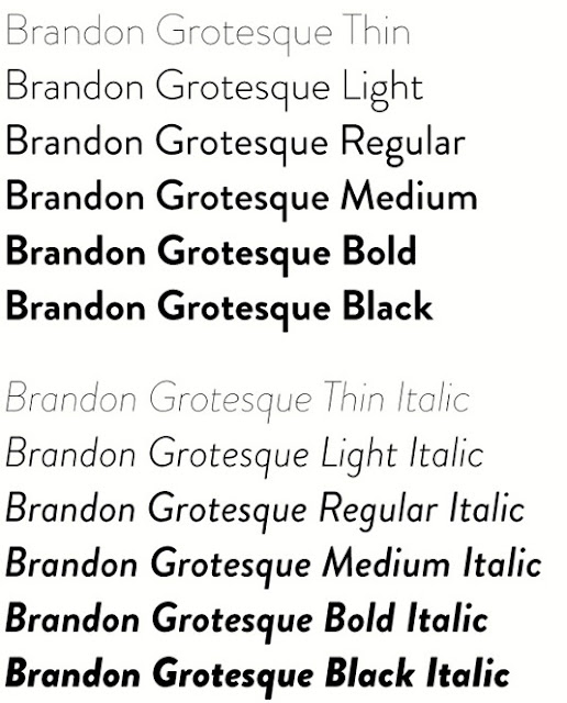
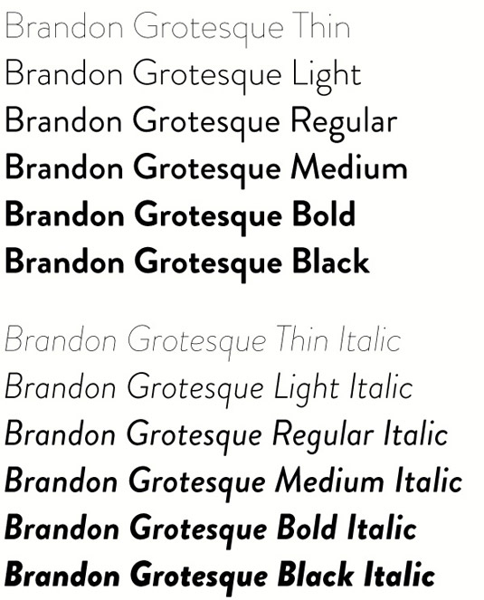
Brandon Grotesque
Brandon Grotesque is a sans serif type family of six weights plus matching italics. It was designed by Hannes von Döhren in 2009/10. Influenced by the geometric-style sans serif faces that were popular during the 1920s and 30s, the fonts are based on geometric forms that have been optically corrected for better legibility.
Brandon Grotesque has a functional look with a warm touch. While the thin and the black weights are great performers in display sizes the light, regular and medium weights are well suited to longer texts. The small x-height and the restrained forms lend it a distinctive elegance.
Brandon Grotesque is equipped for complex, professional typography. The OpenType fonts have an extended character set to support Central and Eastern European as well as Western European languages.
Gotham
Gotham was born in 2000, when men’s fashion magazine GQ commissioned New York-based Hoefler & Frere-Jones to create a new typeface for use in their publication. Provided with a brief to create something “masculine, new, and fresh,” type designer Tobias Frere-Jones drew influences from post-war building signage and hand-painted letters seen around New York City. Using the seemingly plain, geometric lettering from New York’s Port Authority Bus Terminal as the project’s touchstone, an American “working class” typeface was born.
Comments
Post a Comment