Type in Context - Indesign Layout

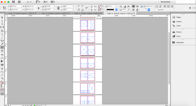
In this blog, I have done some Indesign layouts for the Type in context publication brief  Again, I have followed my layout sketches for where the images and texts with be place. 

Numerous of pictures on each page
Within these layout designs there will be some whihc will be more photography based. Some will have a little bit of text or context to explain the photos and another may has some directional guidance as that maybe the function of the publication. To locate the users to their chosen destinations. 

Below are some screenshots of four different ways that I am going to layout my publication: 


Square & circle themed

Less pictures but more bigger space for the photography

Less amount of space for the photography, but the square/rectangle are consistent


InDesign Layouts and Photographs


Grids

By making my publication more accurate in designs terms, I was informed to use a grid. This will make my photo have more precision within the publication. However, my tutor advise me that my photos that I previously layout were very scattered. This scattered layout would be allowed, however there must be a reason behind this. 

If I was not using the grids and did my placing in a freestyle matter. My reasoning will be that, my publication is many a photographic book which is used only in coffee shops etc. The cause of this particular disperse layout is to only show the contrast between rural typography from two different countries (England & Switzerland). It could also be a scrapbook concept a collection of how rural typography signages has not modify or altered in the many past years. 


Comments

Popular posts from this blog

Type in Context - Final Indesign Layout

After the trial and error of printing the pages with my first intial scrapbook concept. I decide to change the layout of my  pages as the first layout was difficult to work with when adding text.   Instead I did a layout like this (images are below) the text and photographs are in more of a consistent and organised scale. My peers gave me advice on what text to put within my publication pages, they said facts and figures will be interesting as it will relate to the photographs. Because of adding more photographs/text to the pages of the publication, I therefore had to add more pages. So in the end, there was about 30 pages in my publication. Overall, the images on the Indesign preview look decent and I will print this out within the Digital Print room’s paper stock. 

Studio Brief 01 - Secret 7: Final Design

In this design board, I have chosen this Record Sleeve design cover to be my final  submission for the live brief - Secret 7. I particular favoured this design as it really  portrayed the artists song and style well as the variety of the different shades of blue tones gave a good theme for the overall concept of the chosen lyric that I selected. “You were the perfect star. Again describing the meaning of the design will be yet again explained here. The symbolism  of the star is similar to a heart of the person who is going through a heart break thus this  is similar feeling when the break bit is being cracked like glass. The glass look makes it  highlight that the person’s heart is very sensitive and weak and the colours of the different  shades/tones of blue express their unhappiness and also how innocent and pure they are. The way the star outline repeats depicts how the person is slowing forgetting the perfect star  which has broken the heart...

Ideas for Type in Context Publication

IDEAS In this blog post, I have found some examples on how I would like to layout my Type in Context Publication. As my target audience is aimed at people who like hikers and historians. This type of publication will inform the readers how our way finding signages have stayed the same rural design. For the amount of text I want within my publication, the direction of where this publication is going will only be a minimum amount of text. This maybe only just an introduction page and possibly a content page.  The publication will either be a rural guide book or a coffee book for cafe where tourist/hikers/cyclist and so on, stop to have a break for some refreshments. The target audience of this specific type of publication will be at a demographic (geographical).  To create this type of publication, I will use Indesign to help me arrange and layout my pictures. This will then be easier for me to print it out professionally.  The siz...