OUGD603 | Extended Practice | Brief 03 | Development - Publication Layout design - Leah | BBC (Our Generation) - Life being British Born Chinese
Publication Layout - Leah
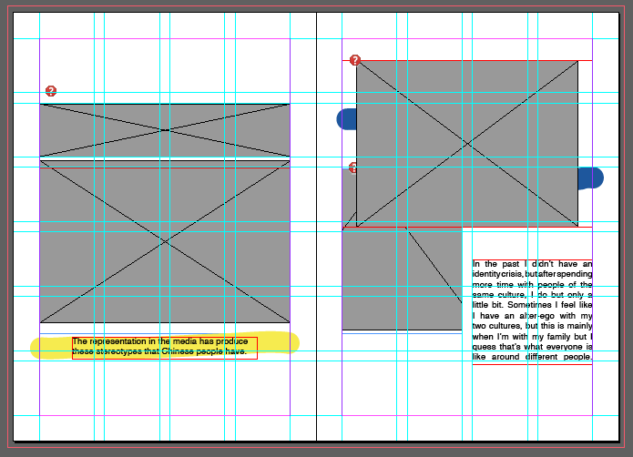
For the inside of the 'Our Generation' publication, the collaborator Leah was in charge of this brief's outcome segment. The publication's layout was constructed with 'Adobe Indesign' Leah made guide lines and measurements to help assist where the Photographs and the text should be placed. Illustrations of a paint brush stroke was experimented to give the pages more characteristics. We mutually agreed to make the size of the publication A5 format, and the number of pages are 16. Previously it was going to be 17, however one participant was unable to provided us with their childhood photo for us. Due to this situation Leah had to be more selective with the photos and information (Quotes) that we believe was significant for outlining our briefs context. Below are some images of this layout format:
Participant page order by names:


Photos and Illustration Additional Publication Contents - Leah
The collaborator Leah also has designed and selected the Childhood photos as our main publication content and from the questionnaire vital quotes that would be interesting to others and to see the perspective of the British Born Chinese individuals. Leah also has done some written Illustration work by hand writing the names out of each participants. These written names are in the chosen colour scheme (red, blue and yellow) so that the front and back covers are consistent with the inside pages.
For the inside of the 'Our Generation' publication, the collaborator Leah was in charge of this brief's outcome segment. The publication's layout was constructed with 'Adobe Indesign' Leah made guide lines and measurements to help assist where the Photographs and the text should be placed. Illustrations of a paint brush stroke was experimented to give the pages more characteristics. We mutually agreed to make the size of the publication A5 format, and the number of pages are 16. Previously it was going to be 17, however one participant was unable to provided us with their childhood photo for us. Due to this situation Leah had to be more selective with the photos and information (Quotes) that we believe was significant for outlining our briefs context. Below are some images of this layout format:
Participant page order by names:
- Katie Sung
- Leah Chen
- Jackie Wan
- Tracey Lau
- Eliza Mo
- Kylie Lee
- Lewis Capper-Tan
- Anthony Chang
- Nathan Li
- Seaulone Liu
- Naomi Lau
- Melissa Leung
- Rou-Qian Poon
- Sammi Yiu
- Sam Chu
- Noel Lee


Photos and Illustration Additional Publication Contents - Leah
The collaborator Leah also has designed and selected the Childhood photos as our main publication content and from the questionnaire vital quotes that would be interesting to others and to see the perspective of the British Born Chinese individuals. Leah also has done some written Illustration work by hand writing the names out of each participants. These written names are in the chosen colour scheme (red, blue and yellow) so that the front and back covers are consistent with the inside pages.
 |
| Name illustration designs |
 |
| Anthony Chang |
 |
| Eliza Mo |
 |
| Jackie Wan |
 |
| Katie Sung |
 |
| Kylie Lee |
 |
| Leah Chen |
 |
| Lewis Capper-Tan |
 |
| Melissa Leung |
 |
| Naomi Lau |
 |
| Noel Lee |
 |
| Rou-Qian Poon |
 |
| Sammi Yiu |
 |
| Nathan Li |
 |
| Tracey Lau |
 |
| Sam Chu |
 |
| Seaulone Liu |
Comments
Post a Comment