OUGD603 | Extended Practice | Brief 04 | Second Idea & development designs 2 | Action against Animal Cruelty Campaign - Petection |
Development design strategy
After discussing that the adoption box would be our final outcome for our collaboration animal cruelty campaign. We divided the design work between us for the adoption box.
Katie
Leaflet designs
Below are some leaflet design that were made there are two different layout of the leaflet design. The information on the leaflet design were collected by the research by our collaboration group meeting. Below are two designs of the campaigns leaflet:
Redevelopment of the leaflet design (Aneta)


Above is the double sided leaflet

Letter design
Below are the thank you letter design for the Petection campaign adoption box. The letter's content includes thanking the consumer who has purchased the adoption box and hopes that pet that they adopted will enjoy the treats and where their donation has been used for.
Poster design
For the poster size will be in A3. The poster design that has been experimented with are a grey and backyard background. Both promoting the 'Petection' campaign in a sinister or a innocent approach. We tried to do something similar to existing or current animal campaign poster design. Especially using realistic animals pictures and combining it with graphic typefaces.


(collaborator) Aneta's poster designs


Lining for Adoption box
Below are some images of the original tissue paper lining being shredded by a paper shredder. By shredding the tissue paper into smaller shreds it looks similar to the HappyBunnyClub adoption box hay.


After discussing that the adoption box would be our final outcome for our collaboration animal cruelty campaign. We divided the design work between us for the adoption box.
Katie
- Dog (science medication) & Hamster (Cosmetic testing) poster design.
- Leaflet design.
- Thank you letter design.
- Lining for adoption box.
- Logo sticker for adoption box.
Aneta
- Rabbit (Fur) & Cat (adoption) poster design.
- Sticker design.
- Membership card design.
- T-shirt design.
- Treat packaging design.
Leaflet designs
Below are some leaflet design that were made there are two different layout of the leaflet design. The information on the leaflet design were collected by the research by our collaboration group meeting. Below are two designs of the campaigns leaflet:
 |
| With more than one pattern |
 |
| Two patterns - Paw & Hearts |
 |
| Four patterns |
 |
| Two patterns - Paw & Heart |
The collaborator has also done experimentations on the leaflet design. This is due to the original leaflet being two small for the information that we would like the campaign to make the consumers awareness. The colours that were used for the previous leaflet design was too bright and vivid from the other products for the adoption gift box. Therefore keeping to the light pastel scheme was more appropriate and consistent to the overall whole design. We mutually agreed to use Aneta's final leaflet design as part of the final outcome.


Above is the double sided leaflet

 |
| Above are the two A4 final leaflet designs |
Letter design
Below are the thank you letter design for the Petection campaign adoption box. The letter's content includes thanking the consumer who has purchased the adoption box and hopes that pet that they adopted will enjoy the treats and where their donation has been used for.
 |
| Four patterns |
 |
| Two patterns |
Poster design
For the poster size will be in A3. The poster design that has been experimented with are a grey and backyard background. Both promoting the 'Petection' campaign in a sinister or a innocent approach. We tried to do something similar to existing or current animal campaign poster design. Especially using realistic animals pictures and combining it with graphic typefaces.
- Hamster - Cosmetic practices
- Dog/puppy - Science medication practices


(collaborator) Aneta's poster designs


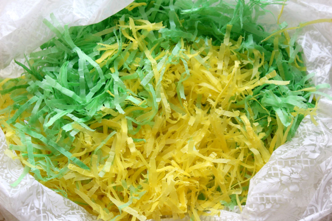
Lining for Adoption box
Below are some images of the original tissue paper lining being shredded by a paper shredder. By shredding the tissue paper into smaller shreds it looks similar to the HappyBunnyClub adoption box hay.

Comments
Post a Comment