OUGD603 | Extended Practice | Brief 04 | Development designs - Website Research & Design (Aneta) | Action against Animal Cruelty Campaign - Petection |
Website Design - Research (Aneta)
For a more social and wider network for our campaign we discussed to create a online website design that specifying Animal cruelty. As my collaborative partner is in charge of designing our campaign website. She has done some research of how online animals charities/campaigns function and how the layout is like.
The first example is WWF
'WWF' is the world’s leading independent conservation organization. 'Our mission is to create a world where people and wildlife can thrive together.' The web page is friendly and colourful, containing lots of features like adoption, donation, a feature where everyone can join them. On the bottom of the page viewers can find options like contacts, terms and conditions etc. There is also used 'WWF' logo.


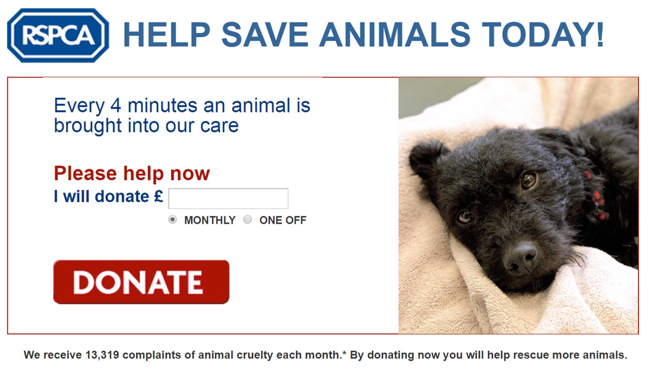
RSPCA


'The Royal Society for the Prevention of Cruelty to Animals is a charity operating in England and Wales that promotes animal welfare'. Layout for the web page is simple, using limited colours. The first thing which shows up while entering the site is a feature of 'Donation', going down the page the viewer can see photographs of animals people can donate for.


Guide Dogs

Guide Dogs
'Introduction to how Guide Dogs makes a difference through mobility, campaigning and research'. Thought Guide Dogs web page people can sponsor dogs. By sponsoring a puppy consumers will receive a gift pack. On the bottom of the page you can find features like contact details and some useful information.


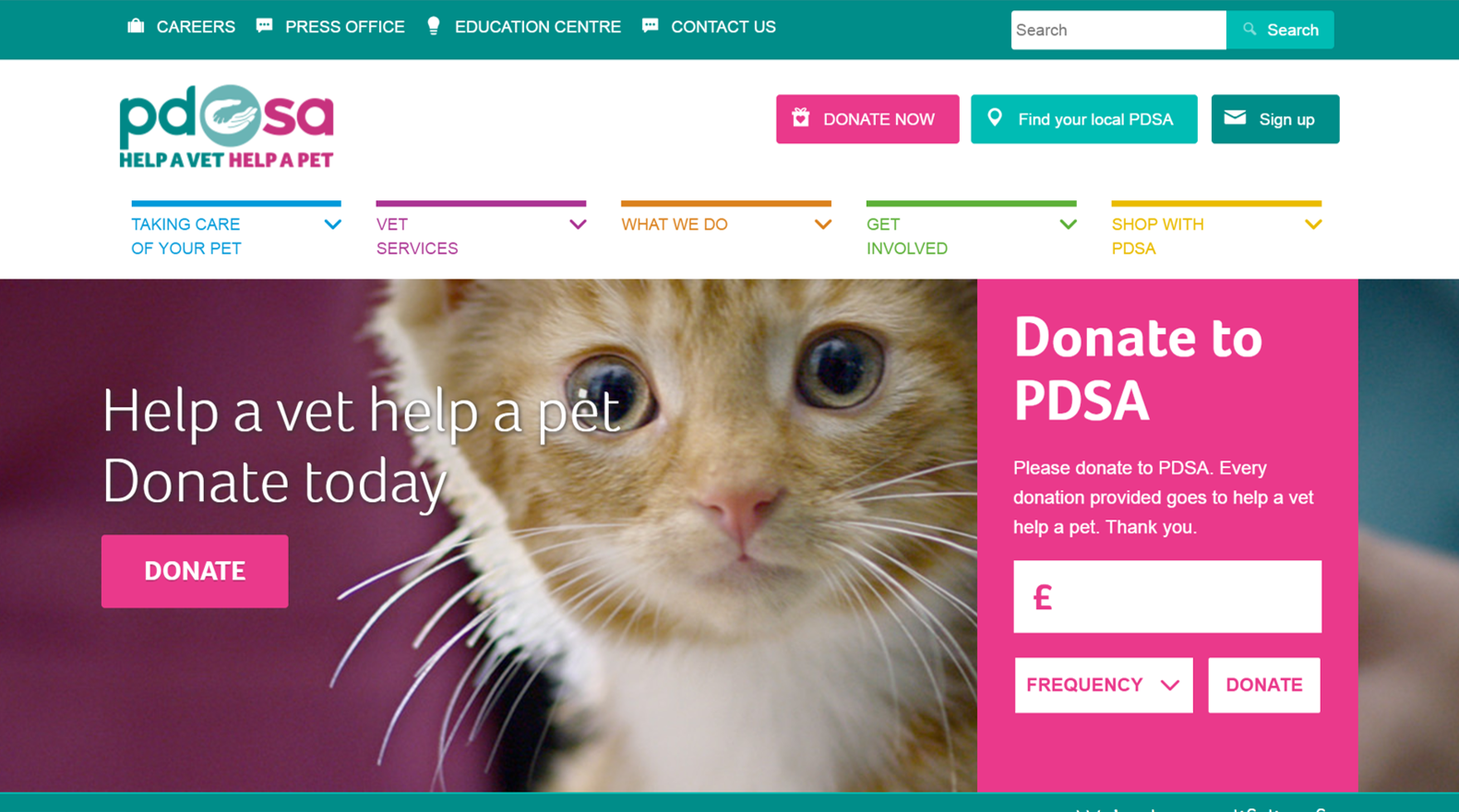
PDSA
PDSA provides free veterinary care to the sick and injured pets of people in need and promotes responsible pet ownership. On their webpage viewers can donate, and get involved. Compared to the webpages from the previous charities which I have found this page has lots of different features. Everywhere you move your cursor some new features are showing up.


Wire Frames designs - Petection.co.uk - Aneta
My collaborator Aneta created some initial Illustrator vectors sketches for our campaigns website mock-ups. Below are the digital wireframes for the Petection website.


Sitemap design
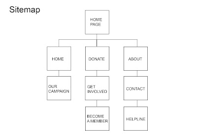
Home Page
Aneta's development - 'After reviewing in and creating sketches of how I want my web page to look like I have made some changes to the previous sitemap mainly because some of them would repeat the same thing.'

- Home Page - 'Home Page' will contain posters and articles about animal's issues.
- Adopt - 'Adopt' page will contain a 'donation' feature. It will also allow readers to pick up an animal they want to donate money for each month.
- Get Involved - 'Get Involved' will contain information why people should sponsor an animal and a gift which a person will receive after sponsoring an animal.
- About - 'About' page will contain a charity logo and information about the campaign.
- Contact Us - 'Contact Us' page will contain a feature to contact the charity by phone or email.
Sitemap design
Home Page
- Home > Our Campaign
- Donate > Get Involved > Become A Member
- About > Contact > Helpline
Aneta's development - 'After reviewing in and creating sketches of how I want my web page to look like I have made some changes to the previous sitemap mainly because some of them would repeat the same thing.'

- Home Page
- Home > News
- Adopt
- Get Involved
- About > Contact
Comments
Post a Comment