
Design for Screen - Airline Logo Swoop design

Proceeding with the sketches, I have developed them in a digital format via Illustrator. I could not decide if wanted a simple logo icon or just the name itself. Therefore below are some images of testing which logo I will go for. It was quite a difficult decision between the paper plane icon or the word swoop with the long curved dashes. Both looked simple yet eye catching and both were very appropriate for the concept. In the end I decide to go with the name swoop with the long curved dashes under it. Some of my peers advised that I could in corporate the paper plane within the app as a loading screen or an icon for a section in the app. 


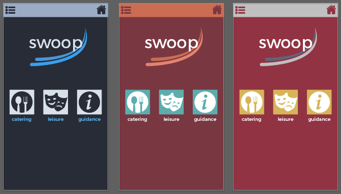
I then tested the chosen logo against the colour scheme again, in case there might be some change to the design. Overall, the previous chosen colour scheme (blue, purple, gold, white, black and darker blue) was suitable for the phone app.


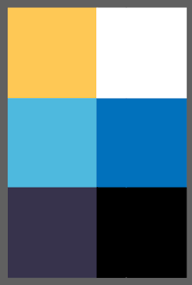
Here is a reminder of the colour scheme: 


Final design of the Airline Logo
Here is the final design of the Airline app (in app form) known as Swoop I have created, this includes the chosen colour scheme and main typeface called Montserrat. The only bit that I have change is joining the letters "oo" closer together by kerning it. It gives the app more character. The gradient blur, conveys a more professional appearance to the app making more appealing to the user to select it, this is strengthened by the colour choice of the app. 
Below is an screen shot of experimenting the logo with an app format, following from the wire frame. I can visually see what other changes may be needed for the app to look more realistic. 


Comments

Popular posts from this blog

OUGD603 | Extended Practice | Brief 03 | Development - Publication Layout design - Leah | BBC (Our Generation) - Life being British Born Chinese

Publication Layout - Leah For the inside of the 'Our Generation' publication, the collaborator Leah was in charge of this  brief's outcome segment. The publication's layout was constructed with 'Adobe Indesign' Leah made guide lines and measurements to help assist where the Photographs and the text should be placed. Illustrations of a paint brush stroke was experimented to give the pages more characteristics. We mutually agreed to make the size of the publication A5 format, and the number of pages are 16. Previously it was going to be 17, however one participant was unable to provided us with their childhood photo for us. Due to this situation Leah had to be more selective with the photos and information (Quotes) that we believe was significant for outlining our briefs context.  Below are some images of this layout format: Participant page order by names: Katie Sung  Leah Chen  Jackie Wan Tracey Lau Eliza Mo Kylie Lee Lewis Capper...

Study Task 08 - Typesetting

In this session, we had to look into the re-typeset of Lewis Carroll's - A Mouses Tale using a postmodern approach and a modernist approach. Lewis Carroll's - A Mouses Tale Original  The Mouse's Tale by Lewis Carroll   "Mine is a long and a sad tale!" said the Mouse, turning to Alice, and sighing. "It is a long tail, certainly," said Alice, looking down with wonder at the Mouse's  tail; "but why do you call it sad?" And she kept on puzzling about it while the  Mouse was speaking, so that her idea of the tale was something like this:— Fury  said to a mouse, That he met in the house,  “Let us both go to law: I will  prosecute you.” Come, I'll take no denial, We must have a trial, For really this  morning I've nothing to do. Said the mouse to the cur,  “Such a trial, dear sir,   With no jury or judge,  would be wasting our breath.” “I’ll be judge, I'll be jury”Said cunning old Fury;  “I’ll try the...

Studio Brief 01 - How Do You Read? - Second Development

In this blog, I have finish printing out the physical  small publication book of Design Principles. I believe this second  development work was successful as the colours of the type has  been nicely and evenly printed out.The information on the  pages are arranged properly in the right order as to the the one  on the Macbook. However, I need to chose a different type of paper  stock which is much sturdier, e.g - card stock. As when I put the rubber band around the spine of the book it curls. Even though the  visuals of the book is very minimalistic and simple I believe this is  appropriate to the audience who would read this kind of book context.  Especially, for young students who want to learn the right knowledge  and information of design principles, whilst becoming a Graphic Designer. For the colour scheme I went for a very neutral yet colourful scheme,  as these colours only outline the significant factors of Design...