
Type in Context - Final Design of Publication

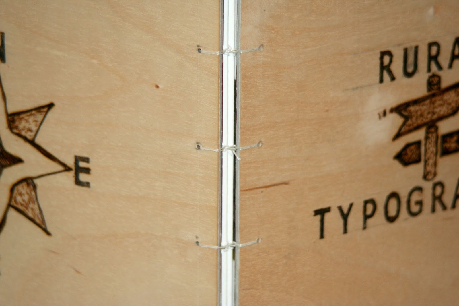
In conclusion, the publication results was produced well. There were only minor trials and errors during the, design production when laying out the pages in Indesign, printing the pages without any missing pages or images being cut off, redesigning the layout due to a change of context/concept and using the pyrography pen was challenging. 

However, I was able to surpass these obstacle and fix them quite swiftly. Overall, the physical produce looks very professional, I am happy with the results if the quality of the pages as the colours came out well, text is clear and understandable to read and the hard cover is simple yet attractive enough for the target audience that it was set to. 

The commerical production time of this publication took quite some time as to get a good and rounded concept/context. But the actaul production of making the publication was relatively in a good pace and more likely to be much quicker. As my time took a little bit longer due to waiting for the pryography equipment to arrive, then practice with it and waiting for the A4 wood sheets to arrive. 

Nevertheless, I am very happy with the results of my publication. The finish product was what I was expecting it to be, I could of made it more professional if I had more excess to other equipment which might of made my commercial production slightly quicker. 


Comments

Popular posts from this blog

OUGD603 | Extended Practice | Brief 03 | Development - Publication Layout design - Leah | BBC (Our Generation) - Life being British Born Chinese

Publication Layout - Leah For the inside of the 'Our Generation' publication, the collaborator Leah was in charge of this  brief's outcome segment. The publication's layout was constructed with 'Adobe Indesign' Leah made guide lines and measurements to help assist where the Photographs and the text should be placed. Illustrations of a paint brush stroke was experimented to give the pages more characteristics. We mutually agreed to make the size of the publication A5 format, and the number of pages are 16. Previously it was going to be 17, however one participant was unable to provided us with their childhood photo for us. Due to this situation Leah had to be more selective with the photos and information (Quotes) that we believe was significant for outlining our briefs context.  Below are some images of this layout format: Participant page order by names: Katie Sung  Leah Chen  Jackie Wan Tracey Lau Eliza Mo Kylie Lee Lewis Capper...

Studio Brief 02 - Licence to Print Money | History of Money & Banknotes Research

Money History The word money comes from the Latin 'Moneta' - which is the first Roman coinage that was minted at the temple of Juno Moneta in 344BC. Before coinage, various objects such as cattle, pig's teeth and shells had been used as money. For most of its history money has taken the form of coins made of precious metal. The money has had intrinsic value. Many of the units of modern money recall their origin in amounts of precious metal (e.g the pound sterling was originally the Roman pound (twelves ounces) of silver.) The Beginning of Banking in Britain In Great Britain, the modern age of banking began in 1640 when King Charles I, needed cash to pay the (English) army that he was raising against Scotland ( of which he was also King.)to seized the golf bullion that many merchants and nobles had placed in the Tower of London for safe-keeping. In 1642, a further warfare broke our with the English Civil War between the King and Parliament. London was the stronghol...

OUGD603 | Extended Practice | Brief 02 | Final Design & Evaluation | Ed's Hairdressers Logo Design

Final Design Below are the final designs of both the logo, shop sign mock up, business card mock-ups and product examples.  These choices are made by the clients.  Business card mock-ups Product mock-ups Hairdresser's store sign mock-up Feedback from client "We were very pleased and satisfied by how quickly and efficiently Katie worked and  designed the logo for us.  Everything was delivered on time. Katie always  communicated very well. We were both impressed with how she incorporated the feedback we gave into her designs, s he always consciously and aware of what we wanted overall, sent many new variations of the logo designs, always referred back to feedback and messaged us for specific information (e.g. Business card enquires) and she was able to explained her designs to us and how it would be much better (i.e. change of the colour scheme).  To conclude the final results were great.  I would highly recommend Kati...