In this session was the final critique for our typeface design, we did a similar rotation of Studio Brief 01: Logotype as we left our work/presentations based on our final design of our typeface and wrote feedback about them.
I like how my final typeface are both equally legible to read visually and physically. Like if there was a children’s book made for a blind child, the mum can read it out loud. Whilst the
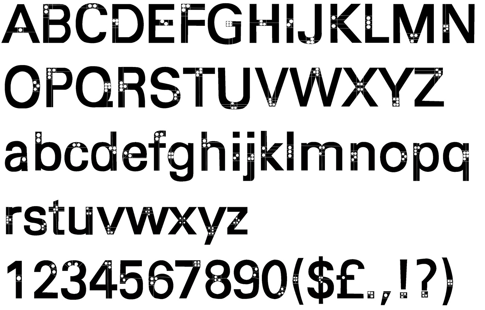
blind child can read along to with the Braille on it.


These were the questions I left for my peers to answer:
1) What kind of emotions do you feel when looking at the Final design typeface?
2) Do you think the influence typeface (Univers) was appropriate for my word (numerous)? If you agree why? If not why and suggest another one?
3) Excluding the final design typeface, out of all the other designs which one do you like and which one also portrays 'numerous' better. Please explain why?
4) The scale of my final piece to me is more of a practical use than a display use. Do you agree? If yes why and if not, why?
5) Do you like the idea of me incorporating Braille into a typeface? If yes why? If not why?
Here is my final typeface design: I chose the Braille and lines typeface design as it has a practical use, if manufactured. Compared to the other, which are just different designed typefaces. The lines within the typeface can outline where the Braille circles should be placed within the each letters. So this typeface is more of a practical use than a display use.
I like how my final typeface are both equally legible to read visually and physically. Like if there was a children’s book made for a blind child, the mum can read it out loud. Whilst the

Feedback from peers
In addition, these are the comments my peers gave me on my final design: I love the idea of the combination of braille and normal writing could be used to great effect; Yes, I
could see it being used in every day life; Confused almost. A lot of though and theory has gone into the type; Don't feel any emotions; how I love the concept of focusing on
braille and using circles, very clever; Univers if a good choice as the letter forms are quite curved, which relates to the use of circles in the typeface; Definitely, think it is a
clever response to such a challenging word. I was initially intrigued by the braille idea as it caught my attention; We feel it is formal and practical; Neutral, I feel that this
typeface has more function over form; I like the circle idea. I could see it being used on carnival rides, festivals., basically anywhere you can change the circles for lights
in the typeface; The point of braille is its not in the shape of a letter, but does look effective as it is. The style and influence works; Agree, because its neutral has strong angles
in the font, feels digital; The dot idea, various dots looks more structured more relevance to numerous, more clear; Style works, yes as it refers to your adjective; I think
univers is appropriate as it looks neat and numerical; I think circles design works the best as it reminds me of an abacus; I agree the circle could get lost on small scale; don’t
completely understand the braille reference but final design looks, good, satisfying. Overall, this typeface was a success! I am very please with the written feedback.
Comments
Post a Comment