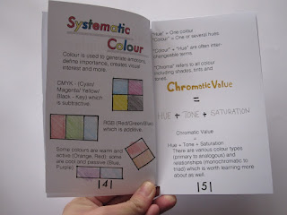
Within this blog, it portrays my final finished small publication book being finalised and produced. This is shown in the images that are on this design board.
I did this printing method via using a Jet Laser printer as it creates a nicely finish polish to the small publication. In which I had hope for was successful, the colours came out
perfectly which is similar to the colours on the Macbook Pro on Photoshop. Especially on the card stock that I had chosen.
Overall, I believe this final design of my design principles small publication book was what I had expected. The small publication is simple yet detailed in the visual and information
aspects. The rectangular shape of the book was suitable to contain the important information that I had collected and researched. The personal illustration which strengthened how it is appropriate the target audience and tone of voice is very informal
yet useful to understand for University student studying within this level of work. And finally how versatile of it is similar to a pocket size notebook, how easily it is to construct and de-construct for the information that the student wants to take with them rather carrying the
whole book with them. And how it is very personal and decorative as the elastic band it changeable to any desire in which the reader would like to stylise their own design
principle book.


Comments
Post a Comment