
Studio Brief 04 - Reflective Practice - Speaking from Experience: Digital work

Here it demonstrates my sketches being converted to Photoshop. Again I am designing each page with important information/tips for first year students to know. For the information that I will put in my guide/tip book I will use, all of it will be in my blog.

My guide/tip book is supposed to be very straight forward, to the point and concise. My book size will be 95mm x 20mm this will be more developed on Indesign. 

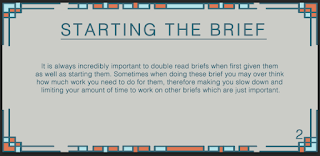
It also shows what colours and design symbols that I will put in my guide/tips book. Again I wanted to make this design quite simple and easy to follow this is very the colours are very understandable, the typeface is clear to read and the symbol/icons are use are good to comprehend. 


Comments

Popular posts from this blog

Studio Brief 01 - How Do You Read? - Second Development

In this blog, I have finish printing out the physical  small publication book of Design Principles. I believe this second  development work was successful as the colours of the type has  been nicely and evenly printed out.The information on the  pages are arranged properly in the right order as to the the one  on the Macbook. However, I need to chose a different type of paper  stock which is much sturdier, e.g - card stock. As when I put the rubber band around the spine of the book it curls. Even though the  visuals of the book is very minimalistic and simple I believe this is  appropriate to the audience who would read this kind of book context.  Especially, for young students who want to learn the right knowledge  and information of design principles, whilst becoming a Graphic Designer. For the colour scheme I went for a very neutral yet colourful scheme,  as these colours only outline the significant factors of Design...

Ideas for Type in Context Publication

IDEAS In this blog post, I have found some examples on how I would like to layout my Type in Context Publication. As my target audience is aimed at people who like hikers and historians. This type of publication will inform the readers how our way finding signages have stayed the same rural design. For the amount of text I want within my publication, the direction of where this publication is going will only be a minimum amount of text. This maybe only just an introduction page and possibly a content page.  The publication will either be a rural guide book or a coffee book for cafe where tourist/hikers/cyclist and so on, stop to have a break for some refreshments. The target audience of this specific type of publication will be at a demographic (geographical).  To create this type of publication, I will use Indesign to help me arrange and layout my pictures. This will then be easier for me to print it out professionally.  The siz...

Objectivity - Subjectivity

Evaluation: Overall, my final evaluation including looking at my peers/year tutors feedback of my logotype. Has shown that I needed to do more research into my colours, as I tried to stick with the original colours of the current logo of Krispy Kreme. As my last critique group told me to stick with them without changing it. Some liked and disliked the outline of the typography as some say it looked like icing, whilst others said it would be better if it were fuller so it makes more of an impact. Most of the comment was about the bad colour choices of the Green as it has connotations of an industrial, chemical and unhealthy look. But some said it could have connotations of high sugar as for a donut. Everyone recognised the doughnut shape for the logo, some saw the neon letter as an American diner look as my critique group told me to stay with the retro look. One of my others peers comment, that the use of the contrast between the Sans Serifs and Serif typography is appropriate to d...