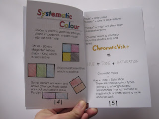
In conclusion, I believe my small publication of my version of design principles was very successful. Even though there were a few trial and errors at the beginning process, I was able to resolve them and learn from them. I believe the typefaces for the small publication was suitable for my targeted audience as ‘Futura’ and ‘Helvetica CY’ are easy yet clear typefaces to read. Overall, I always stuck to these typefaces to the beginning till the end for this small publication. And if I wanted to emphasise an important part of the information within design principles I could simple make it bold or use a bright colour to do this.
The two Graphic Designer that were my inspiration, Carson and Bannecker, were both a good combination as I was able to get an idea on what typefaces would look respectable and organised on the pages from Carson's style as well as the graphical illustrations from Bannecker.
At the end of the brief with the final design of my small publication for design principles. I have really enjoyed this brief for this module, as I am able to choose the things that are personally an interest with me and this was not so much as a complicated brief.


Comments
Post a Comment