In todays session, Simon Harrison gave the class a brief about redesigning a logo for brand that we have chosen. But this time we were told to do this individually. The logo we were allowed to choose could be any type of brand to redesign. However, it either had to be an international or nation brand. So for the start of this brief I went into the shopping district Trinity in Leeds, to find a logo of brand and re-create it to make it more updated or fresh.
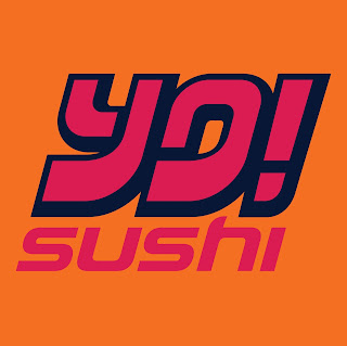
There are some images of the shops within Trinity that I considered to redesign:


Once I have chosen a shop logo which I want to redesign, need to focus on by using only type. I have to experiment with stroke, scale, spacing, contrast and alignment to interpret my chosen company. I need to consider the following:
There are some images of the shops within Trinity that I considered to redesign:

Once I have chosen a shop logo which I want to redesign, need to focus on by using only type. I have to experiment with stroke, scale, spacing, contrast and alignment to interpret my chosen company. I need to consider the following:
- Who is the company?
- What do they do?
- Who is the target audience?
- Where will the logo appear?
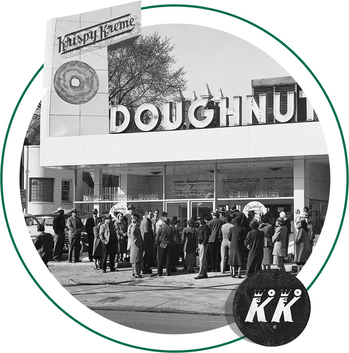
Chosen Shop logo to redesign - Krispy Kreme, Doughnuts
The shop that I wanted to redesign was the 'Krispy Kreme, Doughnuts', this shop is an international brand from America. The reason why I chose this shop was that, the original logo is very American retro, it could be slightly modernised. I believe that the colour scheme could be slightly altered and the combination of Serif and Sans-serif. I'm not sure if I want to keep it to one of them to make the logo more recognisable.
Here is the original logo of Krispy Kreme, Doughnuts:

Krispy Kreme, Doughnuts Research:
The first thing that I did for research into this brand was looking at their website, 'www.krispykreme.co.uk'. On this website I looked into the history of the company on how the brand became international successful.
Our Mission - 'Is to touch and enhance lives through the joy that is Krispy Kreme'.
Our Vision - 'Is to be the worldwide leader in sharing delicious tastes and creating joyful memories'.
In July the 13th, 1937. The first ever doughnuts were made! The owner/founder of Krispy Kreme, Vernon Rudolph brought a secret yeast-raised doughnuts recipe from a New Orleans French chef, he then rented a building in what is now historic old Salem in Winston, Salem, NC and began selling Krispy Kreme doughnuts to a local grocery store. The delicious scent of cooking doughnuts drifted into the streets, and passers - by stopped to ask if they could by not doughnuts. So, he cut a hole in an outside wall and started selling hot original Glazed doughnuts directly to customers on the sidewalk.
In 1944, it was the birth of the Display case. After the war, a showcase was designed for this space. The top served as the counter. Since cakes, doughnuts and cake sticks were made as well as yeast doughnuts, an attractive display could be made of the variety. The display case is a feature you cannot miss when entering the stores today.
1945 - Original glazed, Then and Now - While times has changed a lot, the company's signature Original Glazed Doughnut stayed the same.
In 1955, Bow tie gets a trademarked. The Krispy Kreme bow tie logo is trademarked with familiar green and red colouring.
Fundraising Begins - There were special business ordering from churches, schools, clubs and other organisations took an upswing in 1955, and grown steadily. Using the Fundraising Plan to sell doughnuts, has enabled many schools to buy uniforms and take school trips. The plan has also helped many organisations to buy air conditioners, pianos, and libraries for schools. It has helped to fund scholarship programs/
In 1963 , Production - Hand Production was a thing of the past when automation took over. The planning and timing of production became a vital task.
In 1973, Vernon Rudolph dies - Krispy Kreme held in trust by a bank for three years, at this point Krispy Kreme has grown to to a southeastern chain with 60 shops.
In 1989, first retail store - The first ever retail-only store is opened which brings the doughnuts out to the customer on the 180 curve production line. This first location is on a High Point Road in Greensboro, NC.
In 1992, birth of the Hotlight - the 'Hot Doughnuts Now' light was developed.
In 2002, Krispy Kreme opened in the UK - They opened their first store in the UK in the World famous Harrods department store in October in 2003. Since then, they have opened Hotlight stores in sites across the UK: this includes the following: Edinburgh, Bristol, Birmingham and Leeds.
Their aim is to make their doughnuts fresh everyday in their Hotlight stores and deliver to their many coffee bars, kiosks and self-serve cabinets across each morning.
Here are some images of Krispy Kreme Doughnut old logo designs:


Overall, in the end of this logotype brief I will have to produce 5 logo type proposals with written justifications of all design decisions.
To complete this Studio Brief, I went the the Krispy Kreme Doughnut store in Trinity and took some pictures, from the outside to the inside. Tried to understand what kind of costumers came in, the smell of the environment, the music which was in the atmosphere etc. I took some pictures of their merchandise: cups, mugs, flask, pens, packaging and also their paper hats.
By experiencing the store, it gave me a deeper insight of the shop and how it portrayed a friendly, welcoming and appealing environment. By this I started looking more into what Krispy Kreme does best, which is their doughnut making. By concentrating on the doughnuts, I looked into the designs how the doughnuts are presented, and images on the internet. And visiting some of its competitors i.e: Dunkin Doughnuts. I wanted to send a message on how this company possess an approachable and yet stylish appearance that all target audience can recognise and treat themselves to something sweet and worthwhile.
Here are some of my sketches of some logo designs, that has influence me to redesign the Krispy Kreme logo. I have also looked at some typefaces which I thought would be more relatable to this store.


Here is the original logo of Krispy Kreme, Doughnuts:
Krispy Kreme, Doughnuts Research:
The first thing that I did for research into this brand was looking at their website, 'www.krispykreme.co.uk'. On this website I looked into the history of the company on how the brand became international successful.
Our Mission - 'Is to touch and enhance lives through the joy that is Krispy Kreme'.
Our Vision - 'Is to be the worldwide leader in sharing delicious tastes and creating joyful memories'.
In July the 13th, 1937. The first ever doughnuts were made! The owner/founder of Krispy Kreme, Vernon Rudolph brought a secret yeast-raised doughnuts recipe from a New Orleans French chef, he then rented a building in what is now historic old Salem in Winston, Salem, NC and began selling Krispy Kreme doughnuts to a local grocery store. The delicious scent of cooking doughnuts drifted into the streets, and passers - by stopped to ask if they could by not doughnuts. So, he cut a hole in an outside wall and started selling hot original Glazed doughnuts directly to customers on the sidewalk.
In 1944, it was the birth of the Display case. After the war, a showcase was designed for this space. The top served as the counter. Since cakes, doughnuts and cake sticks were made as well as yeast doughnuts, an attractive display could be made of the variety. The display case is a feature you cannot miss when entering the stores today.
1945 - Original glazed, Then and Now - While times has changed a lot, the company's signature Original Glazed Doughnut stayed the same.
In 1955, Bow tie gets a trademarked. The Krispy Kreme bow tie logo is trademarked with familiar green and red colouring.
Fundraising Begins - There were special business ordering from churches, schools, clubs and other organisations took an upswing in 1955, and grown steadily. Using the Fundraising Plan to sell doughnuts, has enabled many schools to buy uniforms and take school trips. The plan has also helped many organisations to buy air conditioners, pianos, and libraries for schools. It has helped to fund scholarship programs/
In 1963 , Production - Hand Production was a thing of the past when automation took over. The planning and timing of production became a vital task.
In 1973, Vernon Rudolph dies - Krispy Kreme held in trust by a bank for three years, at this point Krispy Kreme has grown to to a southeastern chain with 60 shops.
In 1989, first retail store - The first ever retail-only store is opened which brings the doughnuts out to the customer on the 180 curve production line. This first location is on a High Point Road in Greensboro, NC.
In 1992, birth of the Hotlight - the 'Hot Doughnuts Now' light was developed.
In 2002, Krispy Kreme opened in the UK - They opened their first store in the UK in the World famous Harrods department store in October in 2003. Since then, they have opened Hotlight stores in sites across the UK: this includes the following: Edinburgh, Bristol, Birmingham and Leeds.
Their aim is to make their doughnuts fresh everyday in their Hotlight stores and deliver to their many coffee bars, kiosks and self-serve cabinets across each morning.
Here are some images of Krispy Kreme Doughnut old logo designs:


Overall, in the end of this logotype brief I will have to produce 5 logo type proposals with written justifications of all design decisions.
To complete this Studio Brief, I went the the Krispy Kreme Doughnut store in Trinity and took some pictures, from the outside to the inside. Tried to understand what kind of costumers came in, the smell of the environment, the music which was in the atmosphere etc. I took some pictures of their merchandise: cups, mugs, flask, pens, packaging and also their paper hats.
By experiencing the store, it gave me a deeper insight of the shop and how it portrayed a friendly, welcoming and appealing environment. By this I started looking more into what Krispy Kreme does best, which is their doughnut making. By concentrating on the doughnuts, I looked into the designs how the doughnuts are presented, and images on the internet. And visiting some of its competitors i.e: Dunkin Doughnuts. I wanted to send a message on how this company possess an approachable and yet stylish appearance that all target audience can recognise and treat themselves to something sweet and worthwhile.
Here are some of my sketches of some logo designs, that has influence me to redesign the Krispy Kreme logo. I have also looked at some typefaces which I thought would be more relatable to this store.


Comments
Post a Comment