
Study Task 03 - Drawing the Detective: Agatha Christie

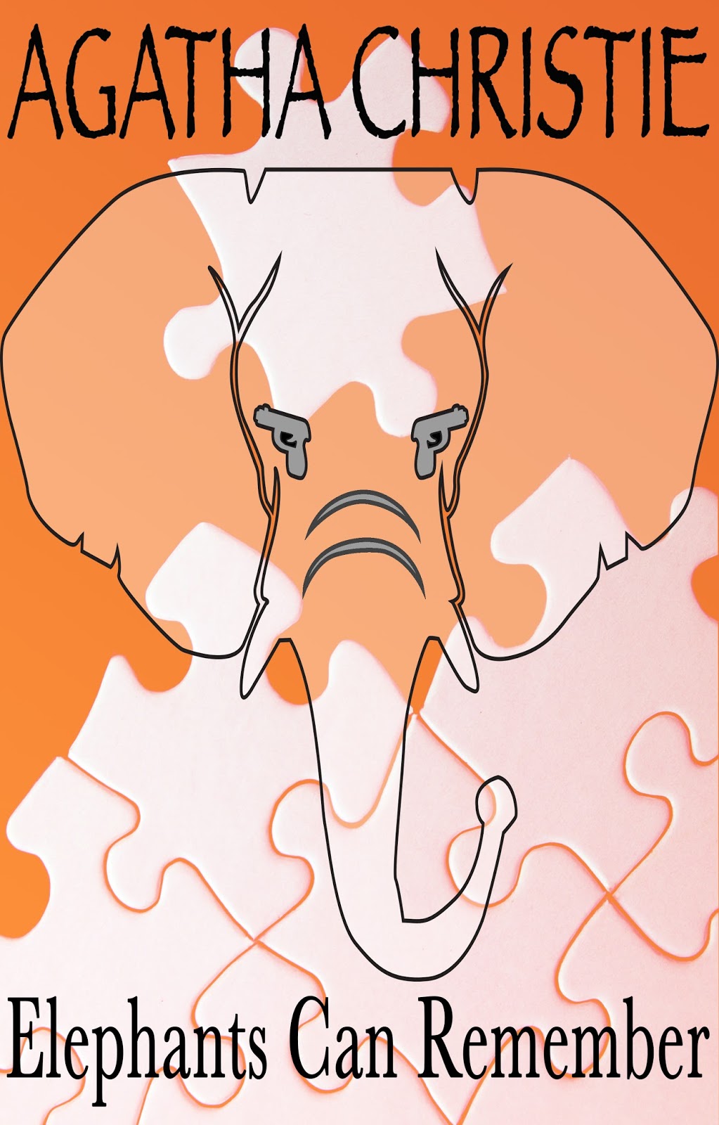
In this Study Task, I have to reproduce a graphic reinterpretation of Agatha Christie's novel, "Elephants Can Remember" as part of the Guardians celebration of what would have been the authors 125th birthday on September 15th.

Here is a picture of Crime fiction by the British novelist Agatha Christie which are on sale at a festival in honour of the birth anniversary of Agatha Christine in Torquay on September 15th, 2015. Photograph by Jack Taylor.


"Elephants Can Remember" is when Ariadne Oliver becomes an amateur sleuth when her goddaughter tasks herself to find out the truth behind her parents' mysterious deaths. Hercule Poirot is determined to solve the goddaughter's parents as the husband and wife had a double murder and there is still an open verdict! Hercule Poirot stood on the cliff-top. Here, many years earlier, there had been a tragic accident. This was followed by the grisly discovery of the two bodies of the husband and wife both shot dead. But who had killed whom? WAs it a suicide pact? A crime of passion? Or cold-blooded murder? Poirot delves back into the past and discovers that 'old sin can leave long shadows' or the term "elephants, based on the assumption that, like that, like the proverbial elephants, they may have long memories of what happened that unfortunate day.

Here is the original book cover for "Elephants Can Remember":


Here is my version of the book cover:


Comments

Popular posts from this blog

Studio Brief 01 - How Do You Read? - Second Development

In this blog, I have finish printing out the physical  small publication book of Design Principles. I believe this second  development work was successful as the colours of the type has  been nicely and evenly printed out.The information on the  pages are arranged properly in the right order as to the the one  on the Macbook. However, I need to chose a different type of paper  stock which is much sturdier, e.g - card stock. As when I put the rubber band around the spine of the book it curls. Even though the  visuals of the book is very minimalistic and simple I believe this is  appropriate to the audience who would read this kind of book context.  Especially, for young students who want to learn the right knowledge  and information of design principles, whilst becoming a Graphic Designer. For the colour scheme I went for a very neutral yet colourful scheme,  as these colours only outline the significant factors of Design...

Studio Brief 01 - Secret 7: Final Design

In this design board, I have chosen this Record Sleeve design cover to be my final  submission for the live brief - Secret 7. I particular favoured this design as it really  portrayed the artists song and style well as the variety of the different shades of blue tones gave a good theme for the overall concept of the chosen lyric that I selected. “You were the perfect star. Again describing the meaning of the design will be yet again explained here. The symbolism  of the star is similar to a heart of the person who is going through a heart break thus this  is similar feeling when the break bit is being cracked like glass. The glass look makes it  highlight that the person’s heart is very sensitive and weak and the colours of the different  shades/tones of blue express their unhappiness and also how innocent and pure they are. The way the star outline repeats depicts how the person is slowing forgetting the perfect star  which has broken the heart...

Objectivity - Subjectivity

Evaluation: Overall, my final evaluation including looking at my peers/year tutors feedback of my logotype. Has shown that I needed to do more research into my colours, as I tried to stick with the original colours of the current logo of Krispy Kreme. As my last critique group told me to stick with them without changing it. Some liked and disliked the outline of the typography as some say it looked like icing, whilst others said it would be better if it were fuller so it makes more of an impact. Most of the comment was about the bad colour choices of the Green as it has connotations of an industrial, chemical and unhealthy look. But some said it could have connotations of high sugar as for a donut. Everyone recognised the doughnut shape for the logo, some saw the neon letter as an American diner look as my critique group told me to stay with the retro look. One of my others peers comment, that the use of the contrast between the Sans Serifs and Serif typography is appropriate to d...