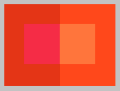
The session started by identifying if the red on the apple was really the colour red?
Then Danny took us to a red circle and told us to stare at it for a while, he then quickly changed to slides to a white background and we could see the red circle faintly. Why is this?


Here is some science based on how our eyes can see colours and transfer the different colours to the brain.


RODS - Convey shades of black, white and grey.
CONES - Allow the brain to perceive colour.
There are three types of cones:
TYPE 1: is sensitive to red-orange light
TYPE 2: is sensitive to green light
TYPE 3: is sensitive to blue-violet light
When a single cone is stimulated, the brain perceives the corresponding colour.
If our green cones are stimulated, we see "Green".
If our red-orange cones are stimulated, we see "Red".
If both our green and red-orange cones are simultaneously stimulated, our perception is "Yellow".
Because of this physiological response, the eye can be "fooled" into seeing the full range of visible colours through the proportionate adjustment of just three colours:


Then Danny took us to a red circle and told us to stare at it for a while, he then quickly changed to slides to a white background and we could see the red circle faintly. Why is this?
Then he should us a paragraph and asked if we could read them? And we could even though the letters are placed different in a word, we are able to read them. As our brain is remembering and is visually reading it. Also if the paragraph or background is in a different colour, we may or may not be able to read it.


The eye contains two kinds of receptors:
RODS - Convey shades of black, white and grey.
CONES - Allow the brain to perceive colour.
There are three types of cones:
TYPE 1: is sensitive to red-orange light
TYPE 2: is sensitive to green light
TYPE 3: is sensitive to blue-violet light
When a single cone is stimulated, the brain perceives the corresponding colour.
If our green cones are stimulated, we see "Green".
If our red-orange cones are stimulated, we see "Red".
If both our green and red-orange cones are simultaneously stimulated, our perception is "Yellow".
Because of this physiological response, the eye can be "fooled" into seeing the full range of visible colours through the proportionate adjustment of just three colours:
RED, GREEN & BLUE


SYSTEMATIC COLOURS - colour principles


LOOKING AT PRIMARY COLOURS


Spectral Colour
The eye cannot differentiate between spectral yellow, and some combination of red and green.
The same effect accounts for our perception of cyan, magenta, and the other in-between spectral colours.
RGB & CMYK?
RGB = Red, Green and Blue
CMYK = Cyan, Magenta, Yellow and Black (Key)


SYSTEMATIC COLOURS (PART 2) - Dimensions of Colour

"Hue" = One colour
"Colour" = One or several hues
"Colour" + "Hue" are often interchangeable terms
"Chroma" refers to all colour including shades, tints and tones


"Intensity", "saturation" or "brilliance" are also interchangeable terms that relate to higher or lower degrees of vividness due to diluted or undiluted colour or pigmentation.


Shades are hues plus black
Tints are hues plus white
Tones, meanwhile, are hues plus grey


PANTONES


Comments
Post a Comment