In this session, was the final critique based on the Studio Brief - Logotype of the brand that I had chosen to redesign 'Krispy Kreme, Doughnuts'. What we did was we left our laptop/Macbook pro on the desk and leave questions of our peers to answer if I was successful with the rebrand design that I had created.
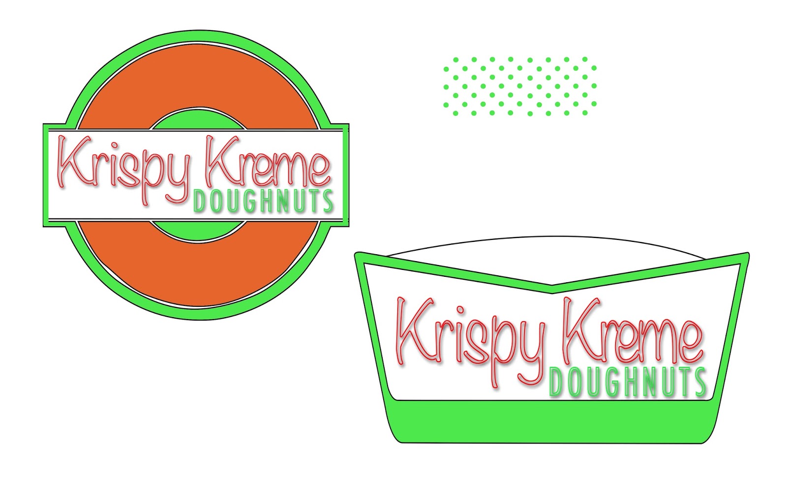
These are some images of my research, development work and final design on this rebrand design project of Krispy Kreme, Doughnuts.


 For my peers I left 5 questions asking about my brand that I had redesigned:
1) Do you think the typography matches well with the brand?
2)What kind of emotions do you feel when looking at the colours?
3) Do you think the combination of typography (Serif and Sans-Serifs) shows the retro and modern concept?
4) Do you believe this logo would be good in a big and small scale for packaging?
5) Do you like how there is an outline of the letters? Or would you prefer it to be full?
MY AIM: To modernised the Krispy Kreme logo. As the original logo has an American retro concept. Krispy Kreme seems more upmarket so I tried to make it look more classy. The current logo is actually a bowtie so I tried my best to change it to make it obvious.
Here is the received feedback that I got given back:
Evaluation:
Overall, my final evaluation including looking at my peers/year tutors feedback of my logotype. Has shown that I needed to do more research into my colours, as I tried to stick with the original colours of the current logo of Krispy Kreme. As my last crit group told me to stick with them without changing it. Some liked and disliked the outline of the typography as some say it looked like icing, whilst others said it would be better if it was fuller so it makes more of an impact. Most of the comment was about the bad colour choices of the Green as it has connotations of a industrial, chemical and unhealthy look. But some said it could have connotations of high sugar as for a donut.
Everyone recognised the doughnut shape for the logo, some saw the neon letter as a American diner look as my crit group told me to stay with the retro look. One said they like the contrast between the Sans-Serifs and Serif as it helps order visual hierarchy.
In conclusion, I think if I did more research into my colours that look appetising than unappetising (green) as it gave most people a mix feeling, and would probably make this logo more successful. Some people understood the outline of typography being like an American diner or even better suggesting it appears like icing on a doughnut. However, some didn't like the outline as a more filled and bolder one would give more impact as a logo. I did some packaging design with my logo on the Krispy Kreme products, however during the day of final presentation the images wouldn't open, but I believe it would of given a clearer visual of it as it would work on a big and smaller scale. Most liked the mixture of the Sans-Serifs and Serifs as they help order visual hierarchy, it looks friendly and welcoming, which is an easy to approach.


These are some images of my research, development work and final design on this rebrand design project of Krispy Kreme, Doughnuts.


1) Do you think the typography matches well with the brand?
2)What kind of emotions do you feel when looking at the colours?
3) Do you think the combination of typography (Serif and Sans-Serifs) shows the retro and modern concept?
4) Do you believe this logo would be good in a big and small scale for packaging?
5) Do you like how there is an outline of the letters? Or would you prefer it to be full?
MY AIM: To modernised the Krispy Kreme logo. As the original logo has an American retro concept. Krispy Kreme seems more upmarket so I tried to make it look more classy. The current logo is actually a bowtie so I tried my best to change it to make it obvious.
Here is the received feedback that I got given back:
- Nice 'DOUGHNUT' hoop shape. Look at Doughnuts for colour choice. Has an American Retro feel - needs more work and investigation. Consider where and how the public will 'see' and come into contact with the 'mark' spacing between Krispy Kreme & Doughnut tight will need more work.
- One of my peers where not keen on the stroked typeface (neon), size of the proportion is very small, which doesn't suit the style, especially with the drop shadow.
- Consider researching friendlier and tastier looking colours as the luminous green looks quite industrial, or reminds me of sourness.
- Colours are very bright but fun. Take out the drop shadow as it would pop on it's own.
- Krispy Kreme type works well reminds me of cream/icing - play on this. Circle works well as a doughnut.
- Yes as it looks like iced lettering!
- Lighter colour of orange, love the bright colour to highlight though.
- Definitely work well together
- Lettering is big enough
- Needs breaking space
- Fits brand amazingly, just lighter donut colour
- Confused chosen colour of green but keep brightly outlined for sure
- Typography too thin, not visible at a smaller scale, should be filled for more impacted
- Mixed. Green works for donut company - neon has connotations to high sugar content
- Experimental with kerning
- Colours look inappropriate and unappetising/ make all colours neon if going for a neon theme
- Green connotations of chemicals not good for company look unhealthy
- Like very much the contrast between Serif and Sans-Serifs typeface, helps to order visual hierarchy
- Prefer the typography to be filled
- Like how it started off classy looking at a bowtie
- Type is really good, it feels less formal, so its actually more friendly and attractive
- Difficult to see typography from a distance .
Evaluation:
Overall, my final evaluation including looking at my peers/year tutors feedback of my logotype. Has shown that I needed to do more research into my colours, as I tried to stick with the original colours of the current logo of Krispy Kreme. As my last crit group told me to stick with them without changing it. Some liked and disliked the outline of the typography as some say it looked like icing, whilst others said it would be better if it was fuller so it makes more of an impact. Most of the comment was about the bad colour choices of the Green as it has connotations of a industrial, chemical and unhealthy look. But some said it could have connotations of high sugar as for a donut.
Everyone recognised the doughnut shape for the logo, some saw the neon letter as a American diner look as my crit group told me to stay with the retro look. One said they like the contrast between the Sans-Serifs and Serif as it helps order visual hierarchy.
In conclusion, I think if I did more research into my colours that look appetising than unappetising (green) as it gave most people a mix feeling, and would probably make this logo more successful. Some people understood the outline of typography being like an American diner or even better suggesting it appears like icing on a doughnut. However, some didn't like the outline as a more filled and bolder one would give more impact as a logo. I did some packaging design with my logo on the Krispy Kreme products, however during the day of final presentation the images wouldn't open, but I believe it would of given a clearer visual of it as it would work on a big and smaller scale. Most liked the mixture of the Sans-Serifs and Serifs as they help order visual hierarchy, it looks friendly and welcoming, which is an easy to approach.

Comments
Post a Comment