KERNING
Common problematic glyphs when kerning include: V, W and Y in both uppercase and lowercase. Unsightly gaps between glyphs also commonly occur between numerals and punctuation.
Kerning is to add or remove space between pairs or glyphs.
A set space is called a monospace typeface.

OPTICAL METRIC AND MANUAL KERNING
Metric kerning uses kern pairs, which are included with most fonts. Kern pairs contain information about the spacing of specific pairs of letters. Some of these are: LA, P, To, Tr, Ta, Tu, Te, Ty, Wa, WA, We, Wo, Ya, and Yo.
Optical kerning adjusts the spacing between adjacent characters based on their shapes.
"Letter spacing should not be mechanically equal but must be achieve equal optical space. The letters must be separated by even and adequate white areas." (Tschichold. J, Lettering as a Work Art)
"Anyone who would letter space lower case would steal sheep." (Goudy. F, Stop Stealing Sheep and Find Out How Type Works)
Examples of some bad kerning, below: The first image looks like '10 F*ckering lights', than it saying '10 Flickering Lights'. Next the bottom right one looks like 'Cover your home in a dick', than 'Cover your home in a click'. Finally the Ellie Goulding album looks like 'Bum', rather than it saying 'Burn'.


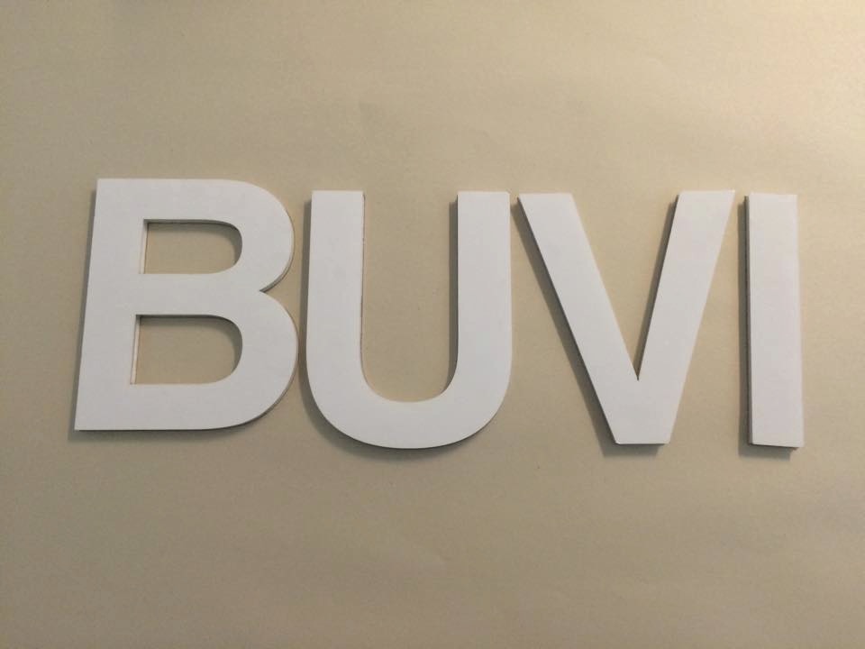
The first word that we created with only 4 letters, was called 'MUVI', this could be seen as a internet website similar to 'Youtube' or a name of a cinema equivalent to 'VUE' and an entertainment store like 'HMV'.
The rest of them are ones which we had to make a new names for the following theme, these are:


Common problematic glyphs when kerning include: V, W and Y in both uppercase and lowercase. Unsightly gaps between glyphs also commonly occur between numerals and punctuation.
Kerning is to add or remove space between pairs or glyphs.
A set space is called a monospace typeface.

OPTICAL METRIC AND MANUAL KERNING
Metric kerning uses kern pairs, which are included with most fonts. Kern pairs contain information about the spacing of specific pairs of letters. Some of these are: LA, P, To, Tr, Ta, Tu, Te, Ty, Wa, WA, We, Wo, Ya, and Yo.
Optical kerning adjusts the spacing between adjacent characters based on their shapes.
"Letter spacing should not be mechanically equal but must be achieve equal optical space. The letters must be separated by even and adequate white areas." (Tschichold. J, Lettering as a Work Art)
"Anyone who would letter space lower case would steal sheep." (Goudy. F, Stop Stealing Sheep and Find Out How Type Works)
Examples of some bad kerning, below: The first image looks like '10 F*ckering lights', than it saying '10 Flickering Lights'. Next the bottom right one looks like 'Cover your home in a dick', than 'Cover your home in a click'. Finally the Ellie Goulding album looks like 'Bum', rather than it saying 'Burn'.

TASK: THE KERNDOWN
In this session we did an activity in small groups of 3 or 4. To select 5 different vowels or consonant either upper case or lower case, and test us if we could make more than one word with those given 5 letters and present them with good amount of kerning. The words that we had made including the kerning was drawn out or outline on a big piece of sugar paper. There are our examples:

The first word that we created with only 4 letters, was called 'MUVI', this could be seen as a internet website similar to 'Youtube' or a name of a cinema equivalent to 'VUE' and an entertainment store like 'HMV'.
The rest of them are ones which we had to make a new names for the following theme, these are:
- PEST CONTROL
- CONDOM
- LUXURY CAR MANUFACTURER
- STUDENT NIGHTCLUB
- CHILDREN SHOW
- QUENTIN T MOVIE


Comments
Post a Comment