Secondary Development
In this secondary development stage as following the previous feedback from the client. I experimented with the two chosen appealing colour schemes. Various shapes for the outline of the Ed's logo were also experimented (diamond, rectangle and circle). The typefaces used for the 'Hair' were Futura Medium, Montserrat Light and Medium, Eurostile, and Alcubierre.
Below are examples of the experimentations - Whilst using the colour black for the main colour for the logo type, this colour was more difficult to see between the purple and blue and purple background. Therefore the colour white made the 'Ed's' more noticeable against the darker colours.


Development - White colours
As shown below the colour white for the main logo made all the other colours of the logo more appealing to the eye.


Feedback - Client
Pattern design


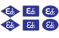
In this secondary development stage as following the previous feedback from the client. I experimented with the two chosen appealing colour schemes. Various shapes for the outline of the Ed's logo were also experimented (diamond, rectangle and circle). The typefaces used for the 'Hair' were Futura Medium, Montserrat Light and Medium, Eurostile, and Alcubierre.
Below are examples of the experimentations - Whilst using the colour black for the main colour for the logo type, this colour was more difficult to see between the purple and blue and purple background. Therefore the colour white made the 'Ed's' more noticeable against the darker colours.


Development - apostrophe design
Underneath are the logo designs with the apostrophe included. Different shapes and sizes of apostrophes designs have been combined with the logos. The thickness, thinnest and depth helps consumers to recognise the logo, pronounce it and the grammatically aspect.


Development - White colours
As shown below the colour white for the main logo made all the other colours of the logo more appealing to the eye.


Feedback - Client
- Overall preferred the logos with the 'Hair' next to the main logo title 'Ed's'.
- They both like both colour schemes, the hairdresser really liked the new colour scheme (blue and purple mix) - request the 'Ed's and Hair' can be coloured in a silver colour.
- They like the idea of the diamond shape is inspired by the Brazilian flag shape. They would like this to be a consistent theme for their brand.
- Requested for the logo 'Ed's' to be slightly smaller and the 'Hair' typeface that they liked was the one on the top right hand corner (Futura).
- The overall, 'Ed's' logo design like preferred was the curved and joined up logo design. This will be further experimented.
- The other logo design specifically the letter 'M' reminds them of macdonald's logo.
By taking these considerations that the clients has provided me I will try to correct them as close to their ideal logo that they would like.
Further Development
 |
| Silver and White logo |
 |
| Silver logo |
 |
| Silver and white logo update without the letter 'e' sticking out of the letter 'd' |
To continue the consistent inspired diamond shape inspired by the Brazilian flag. Experimentations have been produce for this diamond pattern designs. The colour scheme for the diamond shape are silver and gold.
Below are some examples:


Business cards & Pattern mock-ups
During this development stages of producing some business cards mock-ups with the new logo and diamond pattern pattern for the hairdressers and how the combination of the pattern and new logo will look like.
Front design


Back design
Information included in the back of the card:
- Senior Hair Stylist Name : Ed Mascarenhas
- Address : 13 Bramhall Ln S, Bramhall, Stockport SK7 1AL
- Phone Number : 0161 439 8058
- Website : edshair.co.uk
The letters meaning:
- P - Position
- N - Name
- T - Telephone
- W - Website


Feedback from Client:
- They really liked the full three diamond colour shape compared to the others.
- They did not understand the single lettering until explained. This may be a problem for consumers to understand when reading or using the card.
- Typefaces and logo were highly praised.
Final chosen front and back business card designs:
By using the feedback I then completed the first set of the new logo design back to the client and they were very pleased with the results.
 |
| Front |
 |
| Back |
Comments
Post a Comment