OUGD603 | Extended Practice | Brief 09 | Final Design & Evaluation | OOHDEER Brief - Pitch A Papergang competition!
Final Designs
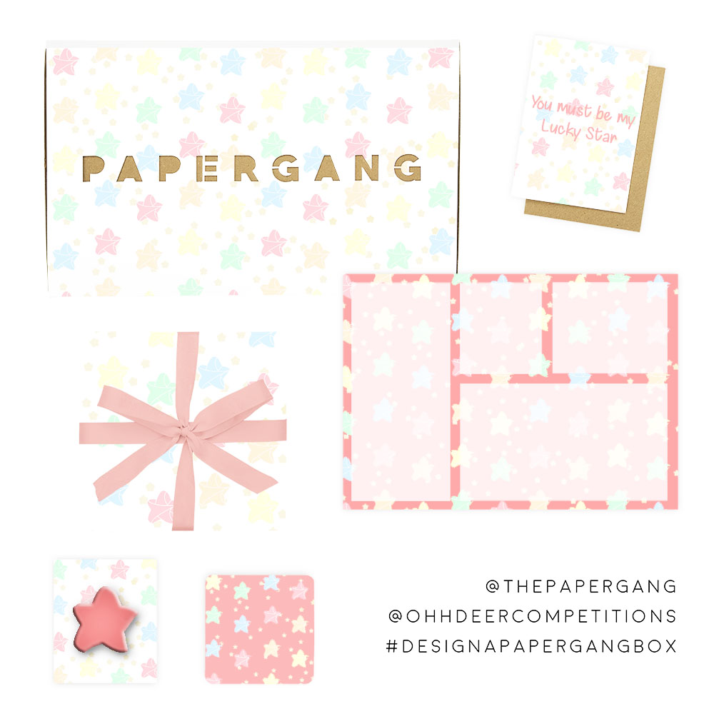
Below are the two final designs of both the Pastel colours Origami pieces. I added small golden stars to both pieces to give the design more character. The reasoning of uploading two designs was because it is optional to upload more than one design to the competition brief and there was a draw between the final two designs.
Submission
On the right hand side is a screenshot of both designs uploaded to the oohdeercompetitions instagram page.


Evaluation
In conclusion the design process of the Papergang boxes was challenging yet enjoyable. In the beginning of the brief, finding a concept/theme was the most difficult part of the box design. Especially looking at previous winners and other artists work. A lot of concepts were already made and taken, thus persuading my design to be completely different from the majority. By regarding to the previous winners and other entries design on the Pitch a Papergang Blog was inspiring as it help break down why certain designs were used as examples on their blog.
By using these past and present entries I was able to identify and acknowledged what recurring shapes, colours, textures, typefaces and illustrative styles were the most appealing to the audience. Majority of the designs were very illustrative and cartoony. Therefore it is vital that the designs for my Papergang box consist of the same elements. The influence of my designs were from popular stationary brand 'Paperchase' & 'Muji' by selecting the elements from both stationary work to constructed the origami Cranes and Stars design.
The illustrations of the origami pieces were sketched by real models. I tried to make the origami models as illustrative as possible thus making to the recurring concept of all previous and current entries. The colour scheme was inspired by Paperchase's collection section of illustrative designs on their stationary. There is a 'Unicorn' collection and the pastel colour scheme was influence for the origami design.
Overall, I found this brief fun yet challenging. The reason of the challenging stages was that the brief was able to test my illustration and drawing skills. Thus digitalising them on Abode Illustrator and Photoshop. In addition I would do this kind of competition brief again in the future if the opportunity comes.
Below are the two final designs of both the Pastel colours Origami pieces. I added small golden stars to both pieces to give the design more character. The reasoning of uploading two designs was because it is optional to upload more than one design to the competition brief and there was a draw between the final two designs.
 |
| Origami Cranes Pattern Design |
 |
| Origami Stars Pattern Design |
Submission
On the right hand side is a screenshot of both designs uploaded to the oohdeercompetitions instagram page.


Evaluation
In conclusion the design process of the Papergang boxes was challenging yet enjoyable. In the beginning of the brief, finding a concept/theme was the most difficult part of the box design. Especially looking at previous winners and other artists work. A lot of concepts were already made and taken, thus persuading my design to be completely different from the majority. By regarding to the previous winners and other entries design on the Pitch a Papergang Blog was inspiring as it help break down why certain designs were used as examples on their blog.
By using these past and present entries I was able to identify and acknowledged what recurring shapes, colours, textures, typefaces and illustrative styles were the most appealing to the audience. Majority of the designs were very illustrative and cartoony. Therefore it is vital that the designs for my Papergang box consist of the same elements. The influence of my designs were from popular stationary brand 'Paperchase' & 'Muji' by selecting the elements from both stationary work to constructed the origami Cranes and Stars design.
The illustrations of the origami pieces were sketched by real models. I tried to make the origami models as illustrative as possible thus making to the recurring concept of all previous and current entries. The colour scheme was inspired by Paperchase's collection section of illustrative designs on their stationary. There is a 'Unicorn' collection and the pastel colour scheme was influence for the origami design.
Overall, I found this brief fun yet challenging. The reason of the challenging stages was that the brief was able to test my illustration and drawing skills. Thus digitalising them on Abode Illustrator and Photoshop. In addition I would do this kind of competition brief again in the future if the opportunity comes.
Comments
Post a Comment